
0 ITEMS

How to Do Cohort Analysis in Excel

Cohort analysis helps businesses understand customer behavior over time by grouping users based on shared characteristics.
- It tracks key metrics like retention, churn, and revenue for specific user groups.
- Time-based cohorts analyze user engagement from the moment they join, revealing trends in retention.
- Behavior-based cohorts focus on actions like first purchases to evaluate marketing and product impact.
- Excel enables cost-effective, customizable cohort analysis with tools like pivot tables and formulas.
- Visualizations like heat maps highlight patterns and critical points where customer retention drops.
This approach allows companies to make data-driven decisions to improve retention and growth, encouraging you to follow the detailed steps in the guide.
What Is Cohort Analysis?
Before defining cohort analysis, we must first understand what a cohort is. A cohort is a collection of individuals who possess a shared characteristic or have undergone a similar experience within a defined timeframe. It is based on various criteria, such as acquisition time, behaviors, demographic characteristics, etc. Some famous examples of cohorts are:
- Customers who registered for a service during the same month.
- Early adopters of Microsoft Windows Suite in 1990.
- Individuals born between 1981 and 1996, also known as Generation Y.
- Students who completed their graduation in the same year.
- Users who downloaded an app within a specific week.
Cohort analysis is a type of behavioral analytics that focuses on the behavior of a specific user group or cohort over time. This method allows businesses to understand how different groups of customers behave throughout their lifecycle, from the moment they engage with the company until they churn or become long-term loyal customers.
Cohort analysis is valuable because it helps businesses understand why specific cohorts stay or leave. As such, companies can tailor their strategies to improve retention. Insights from cohort behavior can guide product improvements and feature enhancements. Furthermore, identifying which marketing efforts resonate with specific cohorts helps allocate resources more effectively. In summary, cohort analysis is a tool and a pathway to more informed decision-making and better business outcomes, making it a valuable asset in your arsenal.
Types of Cohort Analysis
Cohort analysis can be categorized primarily into time-based cohorts and behavior-based cohorts. Time-based cohorts group users who started using a service simultaneously, such as users who signed up in January 2023. This type of analysis is beneficial for monitoring user engagement and retention over time. In contrast, behavior-based cohorts group users according to specific actions or behaviors, such as customers who made their first purchase during a sales event. Both cohorts enable businesses to drill down into specific segments and gain actionable insights.
Benefits of Performing Cohort Analysis in Excel
A cohort analysis in Excel involves defining the cohort, tracking their behavior, and performing trend analysis. It starts by identifying things based on shared characteristics or experiences and monitoring how these groups behave over time, such as engagement, retention, purchase patterns, and other relevant metrics. It ends with comparing cohorts to identify patterns, differences, and trends in behavior. These can reveal insights into customer retention, the effectiveness of marketing campaigns, and areas for improvement in the user experience.
Performing cohort analysis in Excel offers several benefits, particularly for businesses and researchers looking to gain insights into user behavior and trends without requiring advanced software tools. Here are some key benefits:
- Accessibility and Familiarity: Excel is widely used and familiar to many people, making it accessible to those without specialized software knowledge. Most organizations already have Excel as part of their software suite, eliminating the need for additional investments.
- Automation and Efficiency: Users can create macros and use Excel’s automation features to streamline repetitive tasks, making the analysis process more efficient. Once set up, cohort analysis templates can be easily reused and updated with new data.
- Collaboration and Sharing: Excel files can be easily shared with team members and stakeholders for collaborative analysis. Users can leverage cloud-based Excel (e.g., Office 365) for real-time collaboration and version control.
- Cost-Effectiveness: Using Excel for cohort analysis can be more cost-effective than purchasing and learning specialized analytics software. Many organizations already have Excel as part of their standard software package, reducing additional expenses.
- Customization and Flexibility: Excel allows for high levels of customization, enabling users to tailor their cohort analysis to specific needs and criteria. Users can create custom formulas, pivot tables, and charts to visualize and analyze data according to their unique requirements.
- Data Visualization: Excel provides a variety of built-in charting and graphing tools that can help visualize cohort data effectively. Users can create line charts, bar charts, heat maps, and other visualizations to illustrate trends and patterns.
- Detailed Data Analysis: Excel’s powerful data manipulation and analysis functions (such as VLOOKUP, INDEX-MATCH, and conditional formatting) enable detailed examination of cohort data. Users can perform complex calculations, filter data, and apply various criteria to gain deeper insights.
- Integration with Other Data Sources: Excel can import data from multiple sources, such as databases, CSV files, and web queries, allowing for comprehensive cohort analysis. It can also export data to other formats and integrate with analytical tools.
- Integration with Other Data Sources Excel can import data from multiple sources, such as databases, CSV files, and web queries, allowing for comprehensive cohort analysis. It can also export data to other formats and integrate with various analytical tools.
By leveraging these benefits, businesses and researchers can effectively use Excel for cohort analysis to understand user behavior, improve retention strategies, and optimize overall performance.



























































Step-by-Step Guide to Perform a Cohort Analysis in Excel
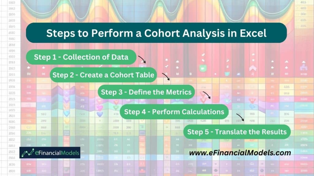
Cohort analysis in Excel allows businesses to track and analyze the behavior of specific customer groups over time. Following a structured approach can gain valuable insights into customer retention, engagement, and overall business performance, leading to more informed decision-making and strategy development. Here are the basic steps on how to do cohort analysis:
Step 1 – Collection of Data
The first step is gathering all relevant customer information. This includes data such as customer ID, sign-up date, purchase history, and other interactions with your business. Ensure the data is comprehensive and accurate, as the quality of your cohort analysis will heavily depend on its reliability. Typically, this data can be exported from your customer relationship management (CRM) system, website analytics, or sales database into an Excel spreadsheet.
Step 2 – Create a Cohort Formula
Next, you need to organize the data into cohorts. A cohort is a group of customers who share a common characteristic, usually at the time of acquisition. In Excel, it creates a formula to segment customers based on their sign-up or first purchase date. To make a cohort formula in Excel, you can use the DATE, YEAR, and MONTH functions to group dates by a specific time period, such as month or year. For instance, you can group customers into monthly cohorts if you analyze behavior month-by-monthly. You can also define your cohorts by creating columns for cohort size (number of users in each cohort) and other relevant segments (such as demographics or user type).
Step 3 – Define the Metrics
Identify and define the key metrics you want to analyze for each cohort. Common metrics include:
- Churn rates (the percentage of customers who stop using your service).
- Conversion rates (the percentage of users who perform a desired action).
- Page views per user (the number of pages viewed by each individual user during a specific period).
- Revenue per user (the revenue amount generated by each individual user over a specific period).
- Session duration per user (the amount of time each user spends on your website during a single visit).
Each metric provides insights into different aspects of customer behavior and engagement. Define how you will calculate each metric and ensure you have the necessary data points for these calculations.
Step 4 – Perform Calculations
With your data organized and metrics defined, you can perform the necessary calculations for each cohort. Use Excel formulas to calculate the metrics for each cohort over the specified periods. For example, to calculate the churn rate, divide the number of customers left by the total number of customers at the start of the period. Repeat similar calculations for metrics such as average revenue per user (ARPU) and conversion rates. Use pivot tables to summarize and visualize the data effectively.
Step 5 – Translate the Results
Finally, analyze the calculated metrics to gain insights and make data-driven decisions. Visualize the data using graphs or charts to make the comparisons clear and intuitive. Look for trends and patterns in the cohort analysis that highlight areas for improvement or opportunities for growth. For example, if you notice a high churn rate in a particular cohort, investigate potential reasons and implement strategies to improve retention. Use the insights to refine your marketing strategies, product offerings, and customer engagement tactics. The ultimate goal is to translate these insights into actionable steps that enhance customer experience and business performance.
By following these steps, you can effectively master how to do a cohort analysis in Excel, allowing you to understand and improve customer behavior and business outcomes.
Cohort Analysis Example
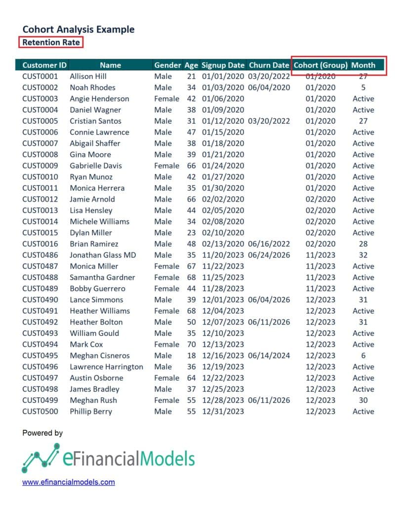
Here’s a cohort analysis example of 500 customer subscriptions from January 2020 to December 2023. The data includes customer details, their subscription date, and the churned date for those who left the company. For illustration purposes, here’s a partial view of our Excel table:
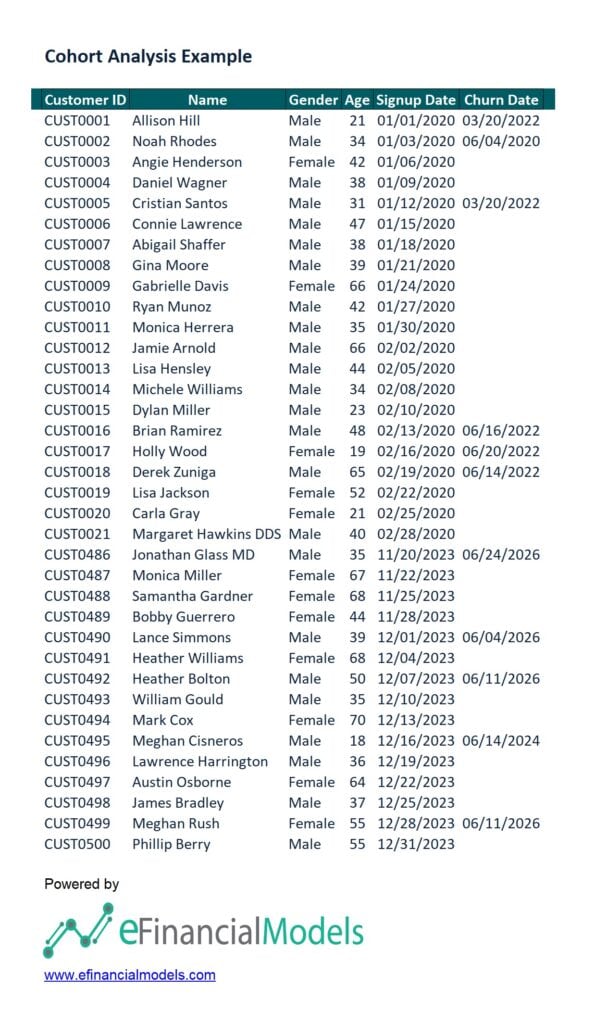
From this data, we employ a cohort formula that returns the first day of the month and year specified in the given cell. This formula is instrumental in identifying the period when similar customers churned. We then define our sample metric as the ‘Retention Rate.’ This metric allows us to calculate the number of months from a customer’s subscription date to the churn date, including those still active.
Afterward, we transformed the data into a pivot table and translated this cohort analysis example.
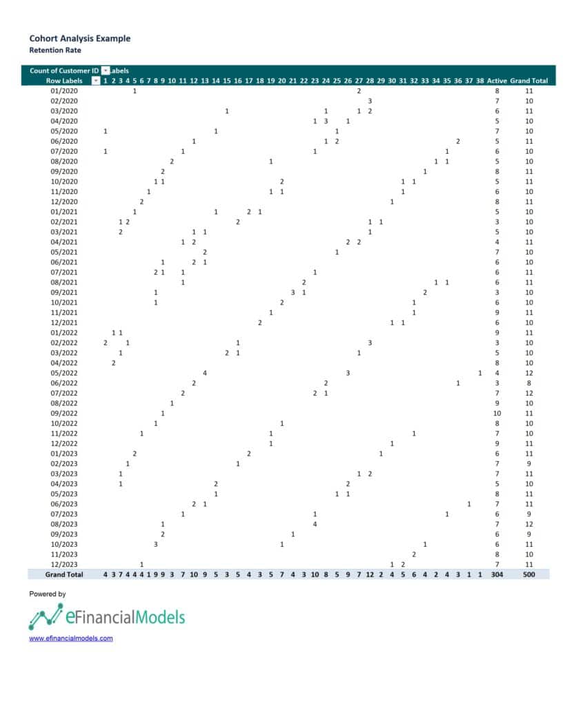
The values in the pivot table indicate the number of customers from each cohort that remain active in subsequent months. For example, if a cohort has a value of ‘2’ in a particular month, it means 2 customers from that cohort were still active in that month. The process continues in the cohort analysis example above. We have transformed the pivot table into a heat index map to identify patterns and trends in the retention rates of the data.
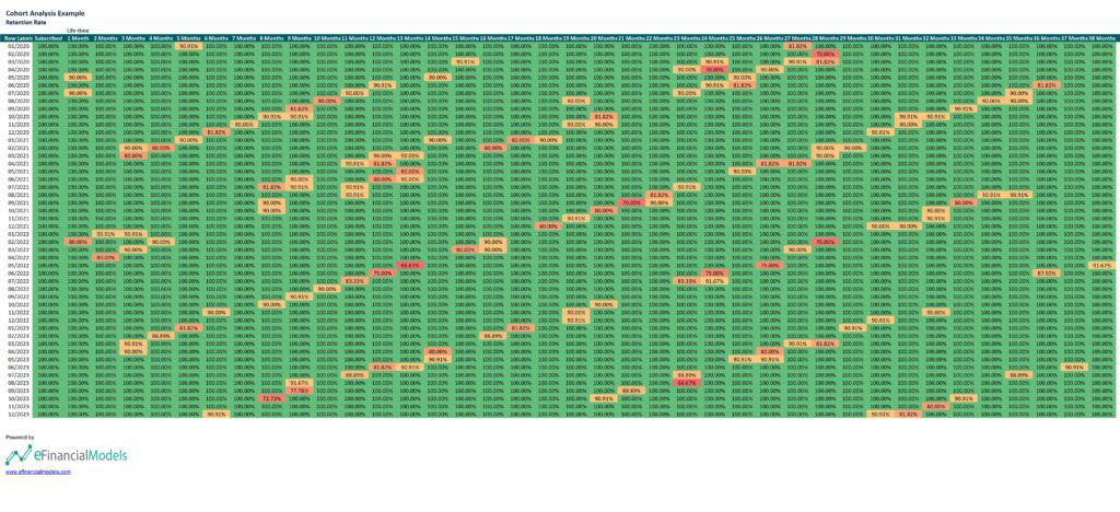
Each row on the cohort analysis example above represents a cohort of customers who subscribed in a particular month. The columns show the percentage of retained customers at different intervals, from 1 month to 38 months after their initial subscription. The green cells indicate a 100% retention rate, while the yellow to red cells represent lower retention rates. The analysis highlights the retention trends over time, identifying points where significant drops in retention occur, which can help understand customer behavior and improve retention strategies.
A company can use these cohort analysis data to identify patterns and trends in customer retention over time, helping to understand the effectiveness of their customer engagement strategies. By analyzing the points where retention rates drop, the company can pinpoint when customers are most likely to churn and investigate the potential reasons behind it. This insight allows for targeted interventions, such as improving customer support, enhancing product features, or offering incentives at critical times to boost retention. Additionally, comparing cohorts can reveal the impact of marketing campaigns, product updates, or changes in customer service, enabling data-driven decisions to enhance overall customer loyalty and satisfaction.
| Disclaimer: This cohort analysis example is for illustrative purposes only and does not constitute professional work or advice. |
Master Cohort Analysis in Excel with Financial Modeling Technique
How to do a cohort analysis in Excel is a complex task that demands skill and patience. It involves organizing and analyzing data to track the behavior of different groups over time. This process requires meticulous data handling, proficiency in Excel functions, and an understanding of statistical methods.
Cohort analysis is a game-changer for businesses. It’s not just about identifying patterns and trends among different customer segments. It’s about gaining insights into customer retention, lifetime value, and the effectiveness of marketing strategies. This analysis can truly revolutionize your decision-making and strategic planning, driving growth and profitability.
eFinancialModels.com offers comprehensive financial model templates and professional financial services to simplify the process. These resources are designed to assist in performing accurate and efficient cohort analysis, saving time and ensuring robust data-driven insights.







































You might also like:
- 10 Main Elements of a Business Plan
- 10 Tips to Develop a First Class Business Valuation Report
- Cash Flow Analysis in Excel
- Financial Modeling for Startups and Small Businesses
- How to Prepare a Financial Feasibility Study?
- How to Do a Precedent Transaction Valuation ?
- 10 Ideas to Increase Average Revenue Per User
- Financial Modeling using Excel
- Understanding Insurance Policies: A Beginner’s Guide
- How to Calculate Annual Recurring (ARR) Revenue for Sustainable Growth
- Business Valuation
- Scenario Analysis
- Startup Financial Models
- 5 Ways COVID-19 Impacts Financial Plans For Retirement & What To Do About It
- Mastering Mobile App Success: A Comprehensive Financial Model for Sustainable Growth and Profitability
- Why Should You Use Excel for Financial Modeling?
- How to Optimize the Average Selling Price: Strategies for Higher Profits
- Financial Model Templates Easy to Use
- Financial Forecasting Models by eFinancialModels
- How to Calculate Net Present Value (NPV)?
Tags: financial modeling