Spot Data Trends With Excel Sparklines

The old English saying “a picture is worth a thousand words” does not necessarily apply to paintings, portraits, images, or, in recent times, even to GIFS. Believe it or not, it also applies to Excel. Sparklines on Excel can be worth a thousand words and numbers when representing data visually.
Spotting trends or patterns in Stock Prices, Sales volume, Multiple Year Net Income/Loss, etc. are difficult when data is presented in a table full of columns and rows of numbers. Charts and graphs with its many types available are useful in this scenario.
But sometimes you may prefer to analyze and spot data trends quickly without adding a big complex chart or graph together with the title, axes, increments, and labels. What do you do? Excel sparklines to the rescue. Sparklines in Excel present the entire data in a compact and simple design.
In this article, we will define what are Excel sparklines and differentiate the types of sparklines in Excel. We will also guide you on how to insert and edit as well as different ways to customize sparklines for Excel worksheets.
Are Excel Sparklines Charts Or Graphs?
Charts and graphs in Excel are very similar but in the strictest sense, these two are different. To sum up and outline the difference
“All Graphs are a type of Chart but not All Charts are Graphs”.
Charts encompass graphs and are much broader in scope. You can say, a graph is a subset of a chart.
A sparkline is a type of chart designed to be compact or small to give a quick representation of a set of data and is normally displayed as a graph without axes. The term was popularized by American statistician Edward Tufte and was described by The New York Times as the “da Vinci of Data”.
Sparklines for Excel is simply a small chart displayed as a background image in single or multiple cells. Why use it over Excel charts and graphs?
- Sparklines in Excel provide a compact overview of a data set to easily spot patterns and trends.
- Sparklines on Excel helps you avoid the burden of creating complex charts.
- These are commonly displayed beside the data source but can be shown alongside any text, number, or values.
- Unlike graphs and charts, sparklines in Excel have embedded charts in a worksheet and are displayed as a background image within a cell. So when a worksheet is printed, these are printed as well.
2 Ways To Create Sparklines For Excel Worksheet
With just a few clicks you can create sparklines in Excel. To illustrate, we will use the below data set containing the Net Income of a tech company’s 3 main products from the years 2000 to 2005.

There 2 ways to create sparklines on the Excel worksheet, by using the Insert tab and the Quick Analysis Tool.
Add Sparklines in Excel Using Insert Tab
Follow these steps to add sparklines on the Excel worksheet.
- Select the cell where the sparklines for the Excel worksheet will be displayed. For this example, select cell H3.
- On the Insert Tab under the Sparklines group select the type of sparkline. For this example, select Line.
- Using the Create Sparklines dialogue box, select the source cells for the Data Range. The example range of cells is B3 to G3.
- Excel automatically pre-fills the Location Range you indicated in Step 1.
- Click Ok.
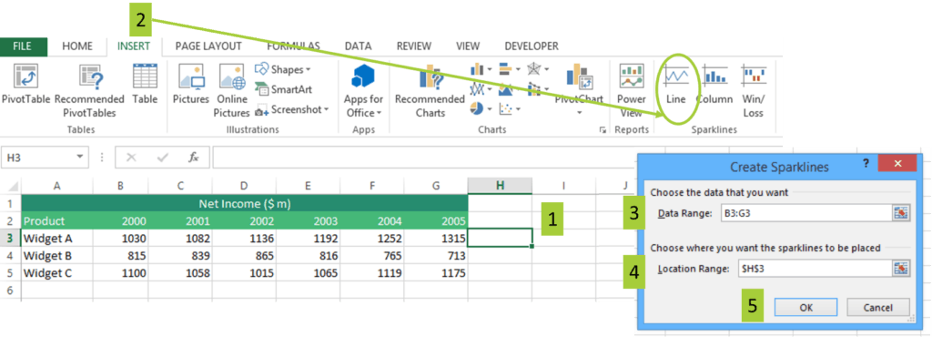
Simply drag and drop the sparklines on Excel to the remaining cells.
Add Sparklines in Excel Using Quick Analysis Tool
The Quick Analysis button helps you quickly organize, analyze, and visualize data by using charts including sparklines for Excel worksheets. Follow these steps to add sparklines in Excel.
- Highlight the source data set. For this example, highlight cells B3 to H6.
- Click on the Quick Analysis button found at the bottom of the selected source data. Alternatively, press CTRL + Q.
- Click Sparklines from the Quick Analysis Menu and pick the Excel sparklines type. For this example, select Line Sparkline.
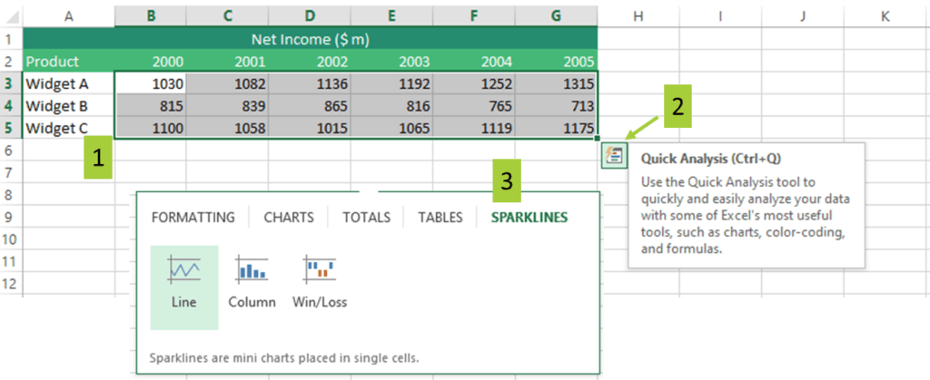

The main advantage of using Quick Analysis is it’s easier and faster to access and use with just 3 steps.
3 Types Of Sparklines On Excel
There are 3 types of Sparklines in Excel, Line, Column, and Win-Loss.
Excel sparkline Type I: Line
The first type of sparklines in Excel is Line Sparkline and is similar to a typical line chart. It helps you spot trends and patterns in the data instantly by showing how much the source data fluctuates. The Line type sparkline in Excel attempts to answer the question; Does data trend upward or downward?
Using our example data source, we can quickly spot Widget A’s Net Income is on an upward trend, Widget B is on a downward trend, and Widget C’s Net Income picked up and is now on an upward trend.

Excel sparkline Type 2: Column
Column sparklines in Excel are small column graphs or vertical bars that help you quickly compare values across data groups. Similar to column graphs, positive values are plotted above the X-axis while negative values are plotted below the X-axis. Zero values are not shown.
For example, spot the magnitude of a steady increase in Widget A’s Net Income. Also, spot the magnitude of decrease in Widget B’s Net Income for 2005 compared to 2004. Inversely, spot the magnitude of increase in Widget C’s Net Income in the years 2003 to 2005.

Excel sparkline Type 2: Win-Loss
The Win-Loss sparklines in Excel is an interesting way to display data at a glance. Visually, it is presented similar to Column sparklines on Excel. Positive values are plotted upward and above the X-axis while negative values are plotted downward. Zero values are not shown. However, The Win-Loss sparklines in Excel do not present the magnitude of the data as positive and negative values have the same size.
To illustrate, assume Widget B and Widget C both have Net Losses.

Notice the Win-Loss sparklines on the Excel worksheet do not reflect the magnitude of the values, all positive values, and negative values are plotted the same way. Visually, all have the same sizes. Using the Win-Loss in Excel sparkline, you can’t identify by how much net income dropped or increased as it only considers if values are positive or negative.
Ways To Customize Sparklines On Excel
You can customize and edit sparklines in Excel using the Design tab for Sparklines. To access this, simply select a cell containing the sparkline.
Assume you need to make the following changes.
- Change the color of the Line type Sparkline for each product into green.
- Place blue markers along the sparklines on Excel’s data points
- Resize the sparklines in Excel
Follow the below steps and examples to guide you on how to modify Excel sparklines.
Format Sparklines On Excel
You can change the style and color of the sparklines in Excel using the Design Tab under the Style group. You can select the default styles from the gallery or pick any color by clicking on the Sparkline Color button
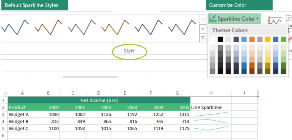
How To Highlight Points in Excel sparklines
To places, markers along with key points of the sparklines’ in Excel simply check the Markers box under Show group. Other highlighting options are also available.

Similar to the Sparkline Color button, you can also customize the colors for the markers and other key points using the Market Colors button.
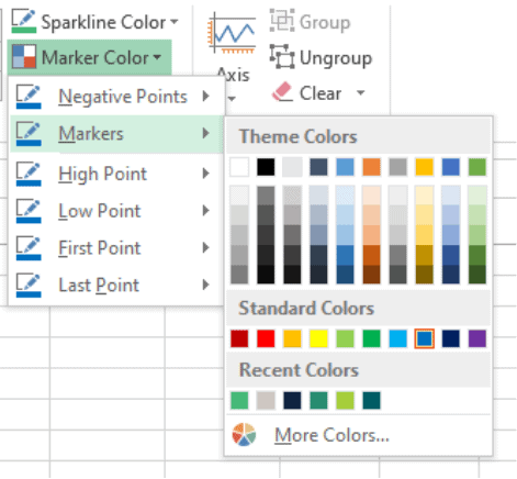

How To Resize Excel sparklines
Sparklines for Excel worksheets are objects or background images in cells, these are scaled automatically to fit in the cell. The size of the sparklines in Excel depends on the size of the cell.
To adjust the width of the sparklines on Excel, change the column wider or narrower
To adjust the height of the sparklines on Excel, change the row higher or shorter.

Other Ways To Customize Excel sparklines
Change Type Of Sparklines In Excel
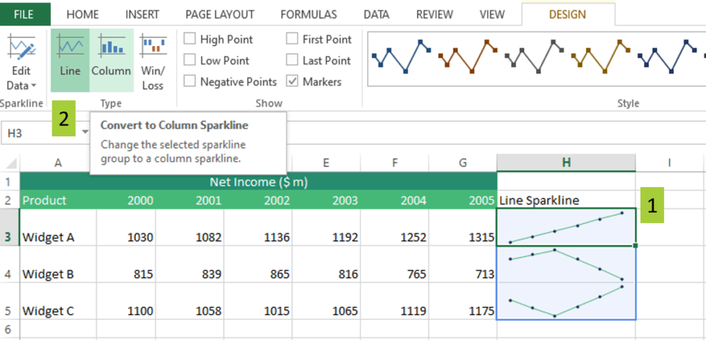
You can easily change the type of sparklines for Excel using 2 steps:
- Select the sparklines on the Excel worksheet
- On the Design Tab under the Type Group, choose the new Sparkline type. In this example, you are converting from Line to Column Excel sparkline.
Change Axis Of Sparklines In Excel
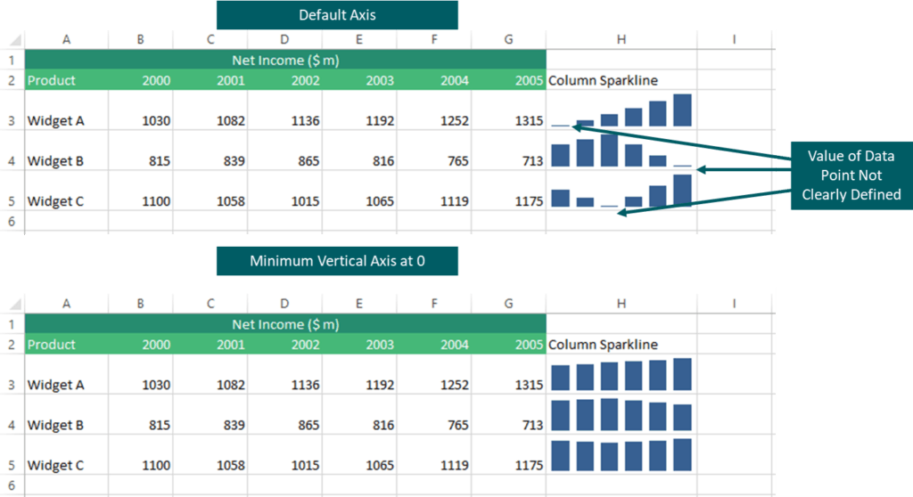
Sparklines on Excel worksheets are normally without axis and coordinates in keeping with its compact characteristic. But, Excel sparklines are flexible and, if needed, the axis can be shown.
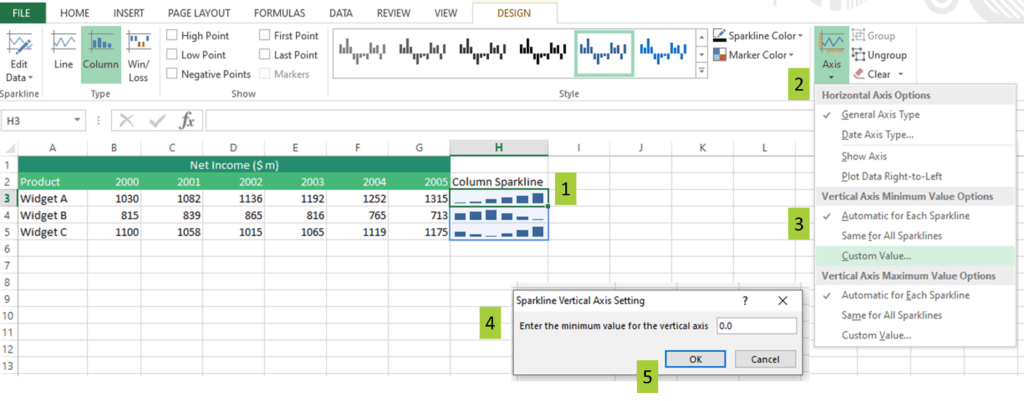
5 Steps to change the axis of sparklines for Excel.
- Select the Excel sparklines
- In the Design tab, click the Axis button
- Under the Vertical Axis Minimum Value Options, click Custom Value
- In the dialogue box, enter either zero (0) or preferred minimum value
- Click OK.
Grouping and Ungrouping Sparklines In Excel
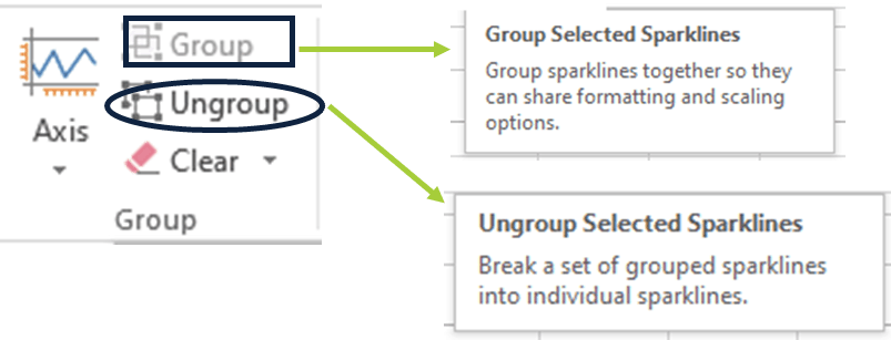
Grouping multiple sparklines on Excel comes very handily when you have to edit and update the data source as the changes will be reflected for the entire group. When you add sparklines for Excel in multiple cells, these are grouped instantly so selecting any Sparkline from the group automatically selects the entire group.
Edit Data For Sparklines On Excel
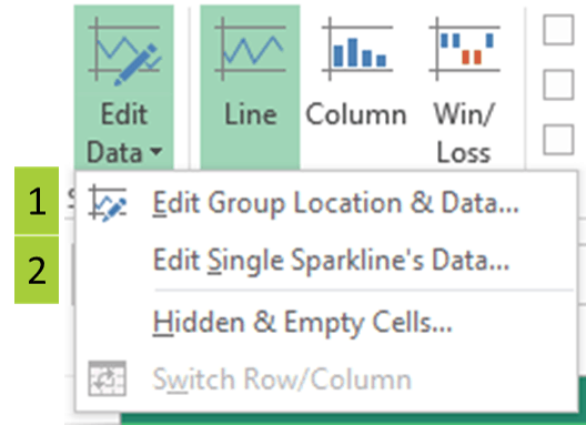
There are 2 ways to edit sparklines for Excel worksheets.
- Edit Data Group Location and Data of Sparklines on Excel. Use this when you want to edit both the data source and the location of a group of Sparklines on Excel worksheets.
- Edit Single Sparkline’s Data. Use this when you want to edit the data source of a single Sparkline only.
Edit Missing Source Data For Sparklines On Excel
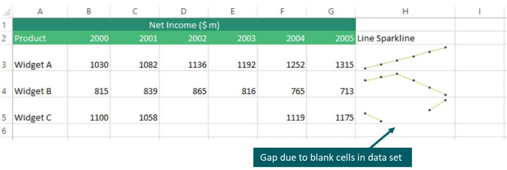
Missing or empty data points common, there are many reasons why this occurs. Failure to update data, a change from one system to another, working with raw data that was not properly cleaned [link to clean data in excel article], etc. Even management or business-related decisions affect data such as closing down a department, discontinue manufacturing, take a product out of the market, etc.
Using the tech company example, assume Widget C was briefly discontinued in 2002 and 2003 thus Net Income was blank. Notice the gap in the Line type of Sparkline in Excel.
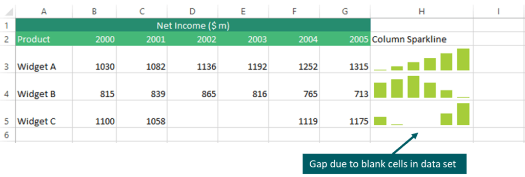
Notice the gap when the Column type of Sparklines for Excel worksheet is used.
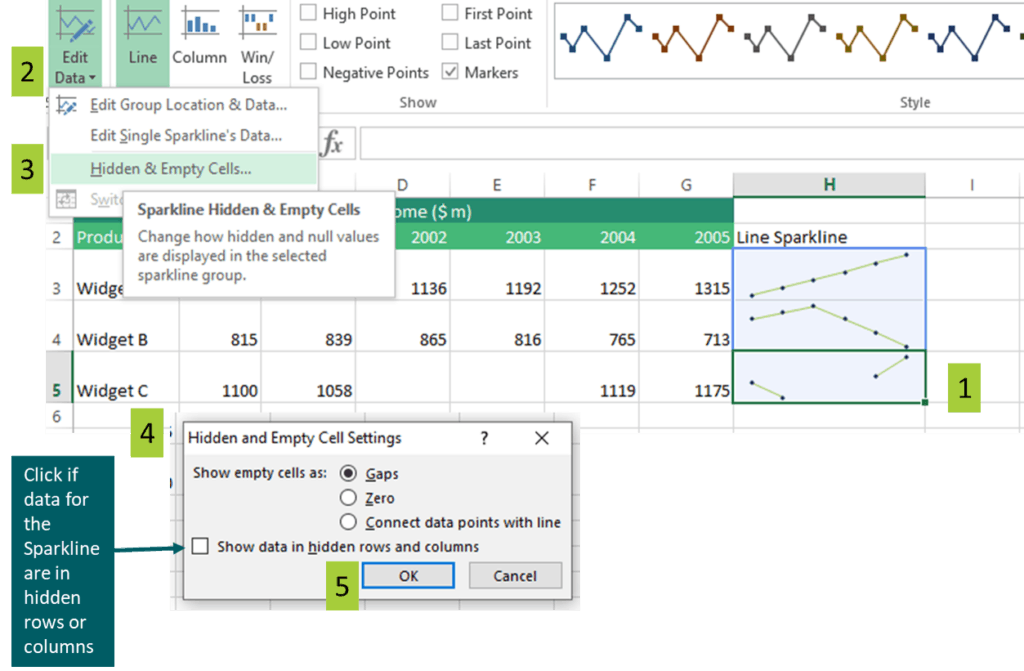
How to handle hidden and empty cells in sparklines on Excel worksheets?
5 steps to handle hidden and empty cells in Excel sparklines
- Select the sparkline to edit
- On the Design tab under the Sparkline group, click the Edit Data button
- From the Edit Data drop-down menu, select Hidden & Empty Cells
- From the dialogue box, select whether to show empty cells as
- Gaps
- Zero
- Connect data points with a line
- Click OK
Delete Sparklines On Excel
Using the Delete key does not remove sparklines in Excel. Recall, sparklines on Excel worksheets are background images in a cell.
To delete Excel sparklines follow the below steps.
- Select the sparklines on the Excel worksheet to delete.
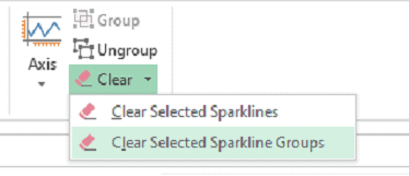
- On the Design Tab under Group, click on the Clear dropdown button.
- Clear Selected Sparklines. To delete only the selected sparklines in Excel
- Clear Selected Sparklines Groups. To delete an entire group of sparklines on Excel
Important Things When Using Excel sparklines
Inserting sparklines in Excel to visualize data is simple and straightforward. Take note of the following when using sparklines for Excel
- Sparklines in Excel can be used in Excel 2010 and later versions. These are not available in Excel 2007 and earlier versions.
- Sparklines for Excel worksheets are small charts displayed as background images in a cell and are good tools to quickly summarize data at a glance. These should not replace Excel charts that provide more details about the data.
Excel sparklines, similar to Excel charts, are customizable. You can edit styles, colors, type, adjust the size, add markers and highlight key points, and edit the data source.

