How To Create a Waterfall Chart For Excel Financial Models

Presenting balances, subtotals, totals or any numbers in appropriate graphs and charts transforms financial data into concise and easy to understand information. Graphs and charts are visually engaging, they enable the target users to make the right assumptions and important inferences. Financial modelers and analysts use it to visually track profitability, liquidity, budgets, expenses, and many other financial metrics. For example, a line graph is used to show trends over time (time series) such as prices of stocks, company earnings per year, etc. A column or bar chart is used as a comparison tool such as how many units of Product A were shipped to customers compared to Products B and C.
In this article, we will discuss a special chart type, the Excel Waterfall chart. We will talk about what a Waterfall chart in Excel is, its features, and its uses. We will show you a step by step guide on how to create a waterfall chart in Excel for any version plus you can download for free a Waterfall chart in Excel template to get you started. We will end the article with a table of comparison between creating a Waterfall chart type available in the 2016 Excel version and a Waterfall chart in Excel from scratch.
Examining Excel Waterfall Chart
What Is A Waterfall Chart In Excel
A Waterfall chart in Excel is a chart showing how a change in positive and negative amounts affects the total amount. The positive and negative amounts can be based on a period of time (values in and out by quarter, yearly) or based on categories (per revenue source, per segment, per region, etc.) Excel Waterfall charts are also used to display the results of a financial model as it effectively illustrates the incremental impact of each period of time or category.
Excel Waterfall chart example
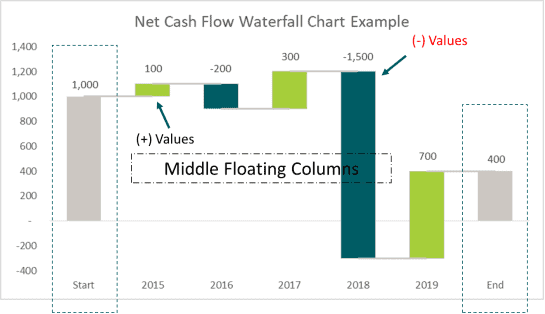
The first and last columns represent the starting and ending total and sit directly on the horizontal X-axis. The middle floating columns represent the positive (values extend upward) and negative (values extend downward) changes. The columns are color-coded to tell apart the total, positive, and negative amounts.
The staircase-like effect is useful for showing how an initial value is affected by subsequent positive and negative changes.
Why Use An Excel Waterfall Chart
Excel has always been the preferred tool of financial modelers and analysts when building great financial models. You can use different charts types such as Pie Chart for illustrating parts of a whole and Spot data trends with Sparklines. Here are the reasons why you should add a Waterfall chart for Excel financial models.
- Visual presentation of financial data. Just like any other chart type in Excel, Waterfall chart makes complex tables and figures easy to understand. It can highlight important aspects as well as present the entire data compactly and concisely.
- Highly Customizable. You can edit the appearance of a waterfall chart just like with any other chart. You can color-code figures, edit labels, and make it as simple or as complex as you like. Due to its flexibility, a Waterfall chart in Excel is widely used in financial model dashboards.
- Great for analytical purposes. You can examine a wide variety of data as well as explain and present the gradual changes in value with a Waterfall chart for Excel financial models. For example, you can use it for performance analysis such as analyzing sales and inventory over a period, evaluate company profits as well as product or service earnings. You can also use it for variance analysis to identify trends and patterns based on the variance between periods and the impact of different factors.
- Displays how you got from one balance to another balance. A Waterfall chart in Excel can demonstrate and break down the cumulative impact of positive and negative values to a total or net value. For example, presenting the Profit and Loss Statement as an Excel Waterfall chart to see how changes in sales, costs, and expenses affected profit. You can also use it for Budget vs. Actual comparison to present the budget changes over time.
Features Of An Excel Waterfall Chart
Waterfall charts for Excel financial models vary in appearance depending on the financial data used but below are the common features:
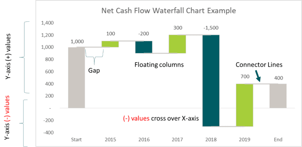
- Floating Columns. Represents the positive and negative values impacting the total value.
- Y-axis is split. The Y-axis is divided into positive (+) and negative (-) to reflect the positive and negative values in the data set.
- Cross over the X-axis. This is an important feature of Waterfall charts for Excel as it adjusts automatically to show movement across the axis. For example, if you are creating a cash flow Excel Waterfall chart, the first amount is 100 while the second amount is -200, a portion of the floating column will be above the x-axis and a portion will be below.
- Connector Lines. Show the relationships between the floating columns. Some Waterfall charts in Excel do not have connectors but these are a useful addition to the chart.
- Gap. Separates the data from another and gives the illusion the columns are floating.
- Color-Coded. Assigning specific colors to the different column types to quickly tell positive from negative amounts.
Step By Step Guide On Creating An Excel Waterfall Chart
Even though it is widely used in Excel financial models, a Waterfall chart in Excel has only become a standard chart type recently with the release of Microsoft Excel 2016 version. Earlier versions of Excel did not carry this type of chart and so financial modelers and analysts had to basically learn and experiment with how to create a waterfall chart in Excel.
Nowadays, many finance professionals and organizations have created their very own waterfall chart in Excel template for presentations to their clients.
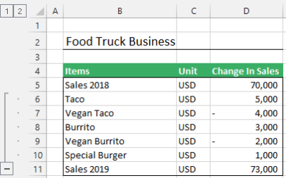
Assume you own a food truck business specializing in 5 food items. Based on the sample Income Statement prepared, you want to know how the change in sales of these 5 food items from one period to the next (2018 vs. 2019) impacted 2019 total sales.
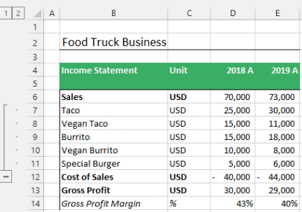
The beginning (start) value is the total sales for 2018 ($70,000) with each product listed is the change in sales from 2018 to 2019. For example, Taco sales are $5,000 more in 2019 vs. 2018 while Vegan Taco sold $4,000 less in 2019 compared to 2018. The final (end) value is the total sales in 2019 ($73,000).
How To Create A Waterfall Chart In Excel For Any Version
Unless you are using Microsoft Excel version 2016, a built-in Waterfall chart type is not available. You can use these step by step guide as a workaround to create your very own Waterfall chart in Excel.
Also, if you are using Excel 2016 and later versions but find it lacking or limiting, you can use these same instructions to create a Waterfall chart for Excel financial models.
You can download the free Waterfall chart in Excel template to assist you through the process and get you started.
Step 1. Prepare the input data
Prepare the input data and add the 5 below columns so it can be presented as a Waterfall chart for Excel.
- Cumulative. A running total value
- Start & End. Track the Beginning value (Sales 2018) and Ending value (Sales 2019)
- Before Change. Prior value before considering a change in value or development in a variable
- After Change. Succeeding value after considering a change in value or development in a variable
- Data Label Position. Used to locate the data label’s position to reflect the appropriate label in the Excel waterfall chart. Find the maximum between “Before Change” and “After Change” columns

Step 2. Insert A Standard Column Chart
Select and highlight the following columns: Items, Start & End, Before Change, and After Change. Then Go To Insert Tab, Click Column Chart
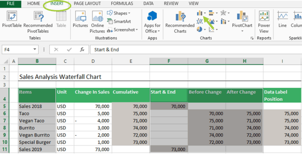
Your initial Waterfall chart in Excel will look like below (colors may vary depending on your chosen Color Theme. But don’t worry about that, we will edit it later).

Step 3. Change the chart type of the “Before Change” and “After Change “series.
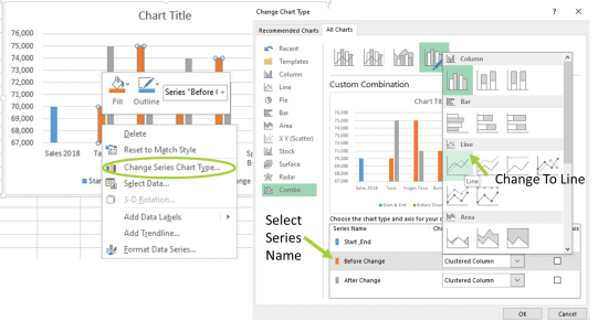
- Left-click on EITHER the “Before Change ” or “After Change ” Series
- From the pop-up menu select Change series chart type
- From the Change Chart Type menu select LINE for both series
- Click OK
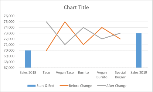
- To activate the Up/Down Bars of the Line Chart, right-click again on either the “Before Change” or “After Change” Line Series
- Click on the Chart Elements icon (Green colored plus sign)
- From the Chart Elements, check the Up/Down Bars box
- The Up-Bars show positive changes, while the Down-Bars show negative changes
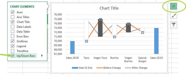
You can now slowly see the bare bones of the Waterfall chart in Excel. Let’s continue!
Step 4. Remove Lines Connecting Up/Down Bars
- Double-click on either “Before Change” or “After Change” Line series
- From the Format Data Series
- Click on Fill & Line
- Select “No Line”
- Repeat the same process for the other Line Series
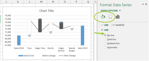
Step 5. Adjust Gap Width or Space
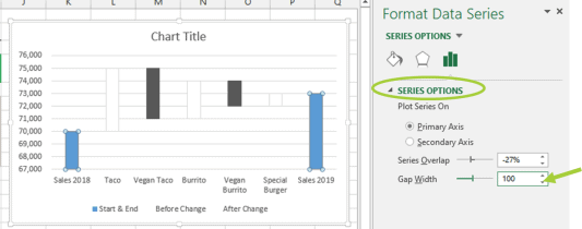
For Start & End Series
- Double-click on either Column
- Select Series Options
- Adjust Gap Width to your preferred choice
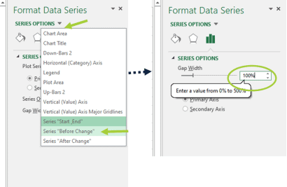
For “Before Change” and “After Change” Series
- Under Series Options Menu
- Click on the down arrow button and select either “Before Change” or “After Change” Series
- Adjust Gap Width to your preferred choice
Step 5. Apply Color coding for Up/Down bars, Start, and End Columns
- Double click on the Up-Bar Series
- From the Format Up Bars menu, go to Fill & Line
- Under Fill, click on “Solid Fill” and select the color of your choice
- Under Border, click “No Line”
- Repeat the same process to the Down bar, Start, and End Column
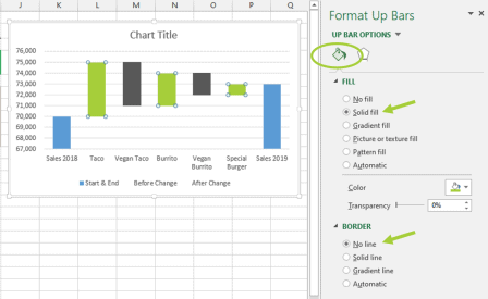
At this stage, you have created a very basic Waterfall chart in Excel. To complete it you need to add Labels, Connector Lines, Chart Title and eventually some aesthetic improvements.

Step 7 Add Data Labels To The Excel Waterfall Chart
For the Start & End Series
- Click on either the column and go to the Chart Elements icon (green colored plus sign)
- Check the box for Data Labels
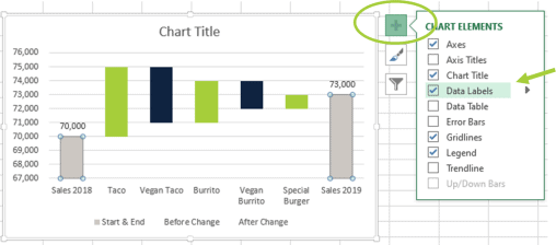
For the “Before Change” and “After Change” Series
Add Data Labels Position (the last column from the table in Step 1) series to the Waterfall chart in Excel.
- Right-click on the Excel Waterfall chart and go to Select Data
- Click “Add” new series
- From the dialogue box input the Series Name and Series Values information from the Data Label Position column
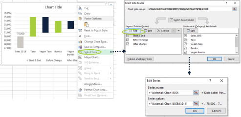
- Right-click again on the Excel Waterfall chart and change the chart type of the Data Label Position series into Scatter. Make sure the secondary axis box is unchecked.
- Click OK
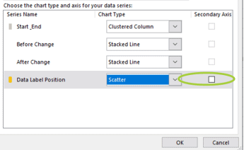
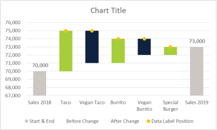
Assign the data labels and fix their position on the Excel Waterfall chart
- Right-click on the Scatter plot and go to Add Data Labels then select Add Data Labels
- Double click on the data labels and select “Data Label Position” Data Labels from the drop-down menu beside Series Options
- Under Label Options, check the box for Value From Cells then select the cells contained in Data Label Position for the Data Label Range. Click Ok
- Uncheck other boxes for Y Value and Show Header Lines under Label Options
- Scroll down to Label Positions and select Above or your preferred choice.
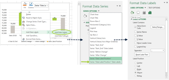
To hide the Scatter Plot Markers
- Right-click on the scatter plot and go to Marker
- From the Marker Options under Fill select No Fill and under Border select No Outline
Step 8 Remove Gridlines from the Waterfall chart in Excel
- Click on the Excel Waterfall chart
- Go to the Chart Elements icon (Green colored plus sign)
- Un-Check the box for Gridlines
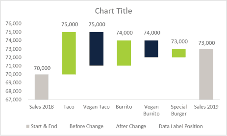
Step 9 Add Connector Lines To The Excel Waterfall Chart Using Error Bars
Insert Connector Lines with Error Bars
- Right-click on the Excel Waterfall chart and go to Select Data
- Click “Add” new series
- From the dialogue box
- For Series Name, type “Connectors”
- For Series X Values, leave blank
- For Series Y Values, Use cells contained in the “Change in Sales” column
- Click Ok
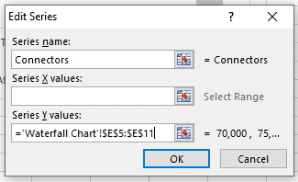
- Click on the “Connectors” series and go to the Chart Elements icon (Green colored plus sign) and check the box for Error Bars.
- Select the Y error bars (vertical bars) and delete them.
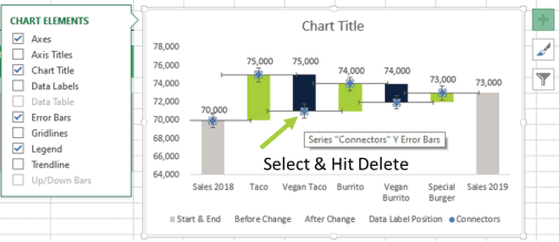
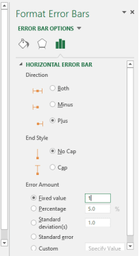
- Right-click on the error bars and select Format Error Bars.
- Under Error Bar Options,
- For Direction, select Plus
- For End Style select No Cap
- For Error Amount, select Fixed Value and type the number 1
To Change Color of Connector Lines and Hide Markers
- Under Error Bar Options
- Go to Fill & Line and select the color of your choice.
- Go to Marker and select No Fill and No Outline
Step 10 Edit Chart Title & Make Aesthetic Improvements
In the Excel Waterfall chart, select the “Chart Title” box and type in a title or you can reference cells
From this stage, you can make any aesthetic changes such as removing legend entries.

Based on the Sales Analysis Waterfall chart in Excel, you can now make assumptions, gather insights, and make necessary adjustments from just simply looking at the data.
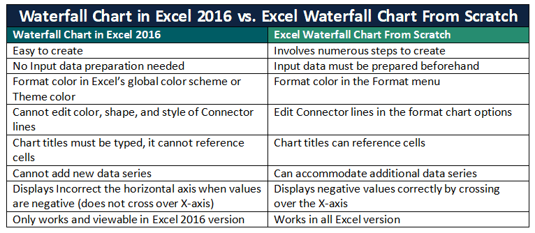
Waterfall Chart in Excel 2016 vs. Excel Waterfall Chart From Scratch
As mentioned before, the Waterfall chart in Excel only became a built-in chart type in Excel version 2016. The main advantage of the Waterfall chart for Excel 2016 is it is very easy. With a few clicks, you can quickly create it compared to building it from scratch. But that ease of use takes away key features needed to build a Waterfall chart in Excel. Here are is a comparison between the two.
