
0 ITEMS

Chart
Excel charts are more powerful and versatile than tools when visualizing data. These charts transform rows of data into clear, actionable insights, making complex information easily digestible. Whether you're a seasoned analyst or a newcomer to data analysis, Excel charts offer a range of types and customization options to suit your needs. From the dynamic column and bar charts that highlight trends over time to the intricate pie charts that reveal your data's composition at a glance, Excel charts empower you to convey your message with precision and impact.
Excel charts are not just tools for data representation; they are canvases on which you can narrate the story of your data. With features that allow you to adjust colors, shapes, and sizes and to add labels and annotations, Excel charts give you the control to tailor your visuals to your audience. This landing page is your gateway to mastering Excel charts, equipped with tutorials, tips, and templates designed to elevate your data presentation game. Transform your data into compelling stories that inform, persuade, and inspire.
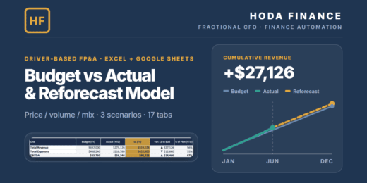

A 17-tab Excel & Google-Sheets FP&A model: driver-based revenue (units…


🔥 Premium AI / LLM Company Valuation Financial Model A…
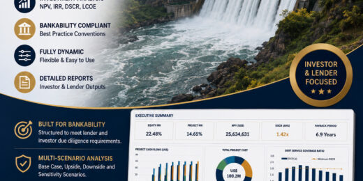

Small Hydropower Bankable Financial Model — Summary This is a…

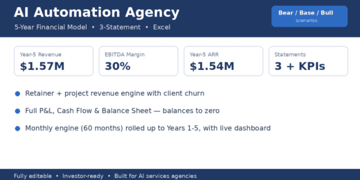

A 5-year, fully editable Excel model built specifically for AI…
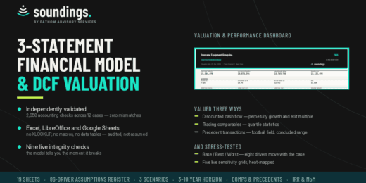

An integrated three-statement operating model valued three ways: discounted cash…
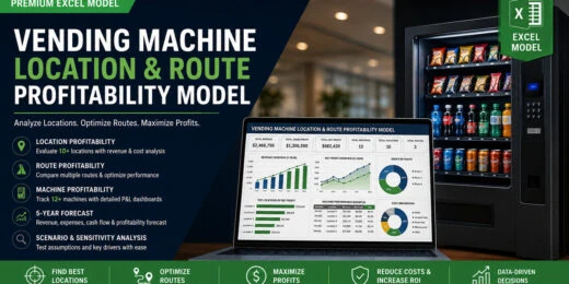
Evaluate a vending-machine business from individual machine economics to location…


Whether you're launching a startup, planning business expansion, preparing for…

Premium Private School & University Financial Model designed for integrated…

Premium 30-year Oil & Gas Upstream and Downstream Financial Model…

🔥 Premium Tokenomics & Web3 Token Launch Financial Model A…

🚀 Premium eVTOL / Urban Air Mobility Financial Model A…

🚘 Premium Autonomous Vehicle / Robotaxi Fleet Operations Financial Model…

A 7-tab Excel & Google-Sheets cap-table model: multi-round priced equity…
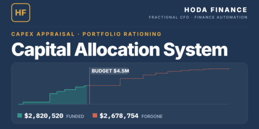
A 26-tab capital allocation system: 20 projects over 25 years,…

A specialized Excel valuation model for longevity and anti-aging biotechnology…


Restaurant Menu Engineering & Financial Optimizer is a professional Excel…

A professional Excel financial model for residential building development projects…

The Data Center Development Financial Model by PDMM is a…

Plan, forecast and value a full-service events company with this…

🚀 Premium Creator Economy Multi-Platform Revenue Financial Model, A professional…
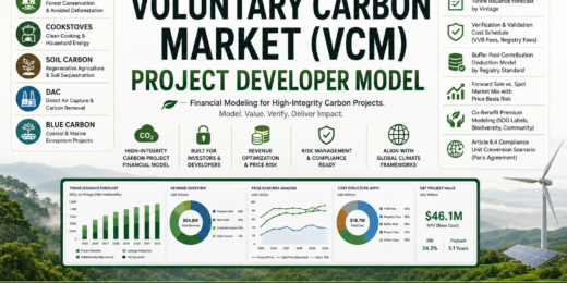
⚡ Premium Voluntary Carbon Market (VCM) Project Developer Financial Model,…

Poultry Farm Financial Model – 10-Year Forecast, Valuation, Feasibility &…

🚀 AI GPU-as-a-Service / AI Compute Data Center Financial Model…

🚀 Premium DAO Treasury & Protocol Revenue Sustainability Financial Model.…

🚀 Premium Embedded Finance / Banking-as-a-Service Platform Financial Model. A…

A premium Excel financial model bundle created by PDMM for…

A professional PFAS Water Treatment & Remediation Financial Model created…

Direct Air Capture Financial Model – Carbon Removal Credits, MRV, Offtake, Storage & Project Finance
A professional Direct Air Capture financial model built for durable…


The Mortgage Payment Scenario Calculator is a comprehensive Excel model…

A professional Excel financial model for planning, forecasting, valuing, and…

A professional Excel financial model for commercial airline planning, aircraft…

A professional Solar + Battery Energy Storage System (BESS) financial…

A professional 5-year integrated financial statements Excel model designed for…
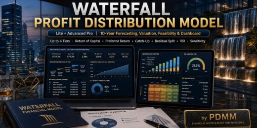
The Waterfall Profit Distribution Model – Up to 4 Tiers…

The Manufacturing Startup Feasibility Financial Model by PDMM is a…

A professional Excel financial model suite for bakery businesses, built…


Depreciation & Amortisation Excel Calculator is a structured, easy-to-use model…

A professional Excel financial model suite for M&A merger analysis,…

A professional Excel financial model suite for Airbnb and short-term…
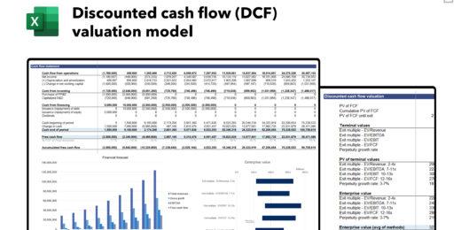


A professional Excel financial model suite for banking and financial…
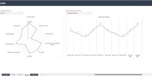

This spreadsheet streamlines the evaluation process and helps provide valuable…
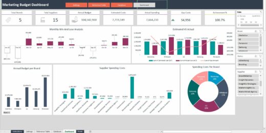
Marketing expenditure refers to the total amount an organization allocates…
Professional Vertical AI SaaS Financial Model Template for B2B businesses…

Highly versatile Excel model for building 5-year monthly equipment rental…
This template provides a centralized and organized view of project…


A structured financial forecast model for Solar PV EPC businesses,…


A dynamic, ready-to-use Excel template designed for AI, GenAI, and…

A streamlined, Excel-based financial model built to evaluate the economics…

This Professional DCF Valuation Model is a clean, structured, and…
The 3-statements financial model (integrating Income Statement, Balance Sheet, and…

For companies preparing to go public, this model shines in…

The Discounted Cash Flow (DCF) method isn't just a valuation…

Trade uncertainty for strategy. Success in the hospital business comes…

Trade uncertainty for strategy. Success in the cafe and restaurant…


Provides a structured framework for tracking and analyzing B2B sales,…

This is an IC-ready Excel model for structuring and underwriting…
Creating Charts in Excel: Visualize Data Now!

The Storytelling Power of Charts in Excel
The storytelling power of charts, particularly in Excel, is rooted in their ability to transform raw data into an easily understandable and engaging visual narrative. A chart is a visual representation of data designed to make information easily understandable at a glance. Charts use graphical elements like bars, lines, dots, or slices to depict trends, patterns, relationships, or comparisons among data points. By translating numerical data into visual formats, charts help summarize complex information, enabling viewers to grasp essential insights without delving into detailed datasets.Benefits of Chart Tools in Excel
Creating charts in Excel allows users to display data contained in a spreadsheet graphically. They are dynamically linked to the spreadsheet data, meaning they update automatically as data changes. Chart tools in Excel are designed to be user-friendly, offering a straightforward way to convert numerical data into visual representations through a few clicks. Creating charts in Excel enhances data comprehension and storytelling in several ways:- Accessibility: Different types of charts in Excel make data more accessible to a broader audience. Only some people are comfortable navigating through spreadsheets or interpreting complex datasets. Visual representations ensure that the insights derived from data are understandable to everyone, regardless of their expertise with data.
- Comparison: Excel charts for financial analysis make comparing different data sets straightforward. Whether comparing sales figures across different quarters or analyzing website traffic sources, they visually break down these comparisons, making disparities or similarities immediately apparent.
- Enhanced Storytelling: Creating charts in Excel enables data storytellers to weave compelling narratives around their data. By selecting the appropriate chart type and customizing it to highlight specific data points, users can guide their audience through the data in a structured, impactful manner.
- Simplification: Charts for financial analysis allow a more precise understanding by distilling complex datasets into a more digestible visual format. This simplification is crucial when dealing with large amounts of data or when trying to communicate findings to an audience unfamiliar with the data's specifics.
- Trend Analysis: Line charts, scatter plots, and other charts for financial analysis facilitate the spotting data trends over time. They are invaluable for forecasting, budgeting, or analyzing the success of a given strategy.

What Are the Different Types of Charts in Excel?
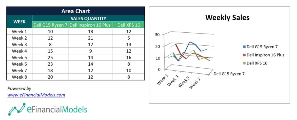
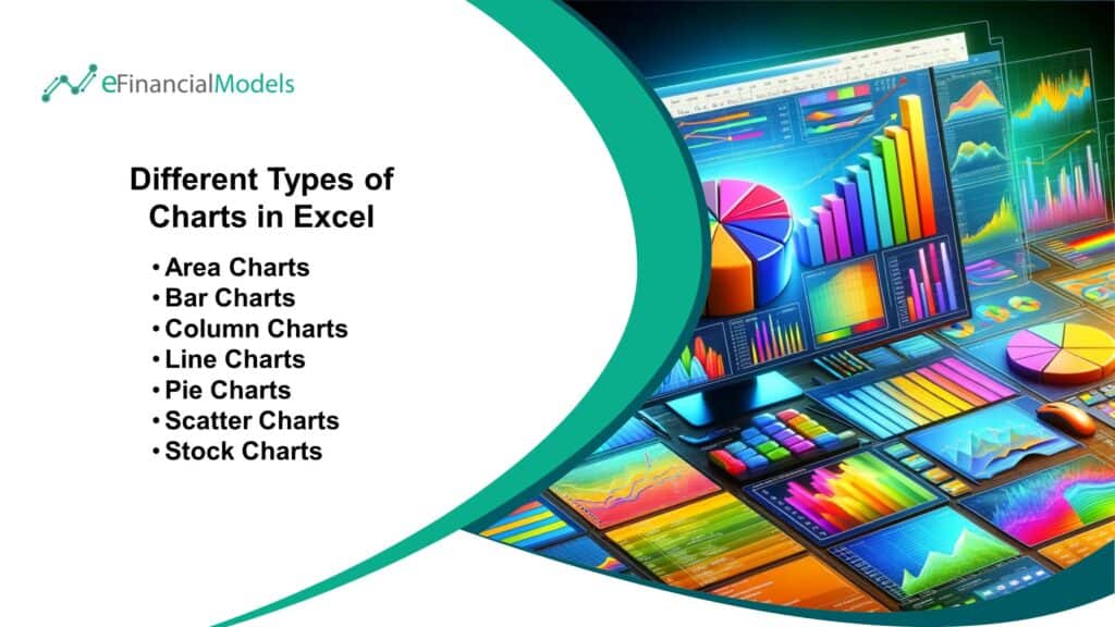
Excel offers a variety of chart types, each suitable for different data visualization needs, especially in the context of financial modeling and analysis. Here's a brief overview of the different types of charts in Excel:Area Charts
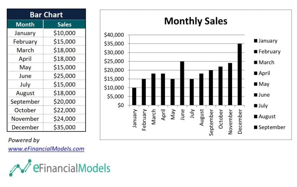
Bar Charts
Column Charts

Line Charts

Pie Charts

Scatter Charts

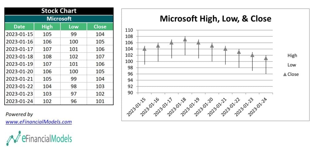
Stock Charts
How to Create Excel Charts for Financial Analysis
Data can seem entirely mute, offering no insights or valuable information unless analyzed and interpreted. Financial chart templates in Excel are indispensable tools for unlocking the true potential and insights hidden within this data. They transform raw data into visually compelling and easily understandable formats, enabling businesses to make informed decisions based on their financial health and performance. Here's a step-by-step guide on how to create Excel charts for financial analysis:Step 1 - Input Data in Excel
The first step in creating Excel charts for financial analysis involves inputting financial data into Excel. This can be achieved by manually entering data into the cells of an Excel spreadsheet or by importing data from external sources, such as databases, CSV files, or other financial software tools. It is crucial to ensure accuracy during this step, as any errors in data entry could lead to incorrect analyses and potentially misleading conclusions.Step 2 - Label Variables Carefully
After inputting your data, it's essential to label your variables clearly. The process involves naming each column with a descriptive and easily understandable title that accurately reflects the data it contains. Proper labeling is beneficial for your understanding and essential for anyone who might view or work with your spreadsheet. Clear labels ensure the data is accessible and interpretable by all intended users, facilitating effective communication and analysis.Step 3 - Organize Data in Table Format
Organizing your data in table format is a crucial step that enhances both your spreadsheet's visual appeal and functionality. Logically organize your data, with each row representing a unique entry (such as a transaction or a date) and each column representing a different variable (such as revenue, expenses, or profit margins). To convert your data into a table, select your data range and then use the "Format as Table" option under the "Home" tab in Excel. It will automatically apply a structured format to your data, making it easier to manage and analyze.Step 4 - Pick the Data & Labels for the Chart
Once your data is properly organized, the next step is to select the specific data points and labels you wish to include in your chart. It involves highlighting the relevant rows and columns in your Excel spreadsheet. The selection should consist of the data you want to visualize (such as revenue over several months) and the labels describing it (such as the months themselves). It's essential to make a thoughtful selection at this stage, as the data you choose will directly influence the insights you can derive from the chart.Step 5 - Select Insert Chart and Choose the Chart Type
With your data selected, navigate to the "Insert" tab in Excel to create your chart. Here, you'll find different types of charts in Excel to choose from, including bar charts, line charts, pie charts, and more. The type of chart you select should be based on the data you're working with and the insights you wish to extract. For example, line charts are excellent for visualizing trends over time, while pie charts are best suited for showing proportions or percentages. After selecting the appropriate chart type, Excel automatically generates the chart based on your selected data. You can customize the chart by adjusting its layout, style, and other settings to suit your needs. By following these steps, you can effectively create Excel charts that provide valuable insights into your financial data, enabling better decision-making and strategic planning for your business.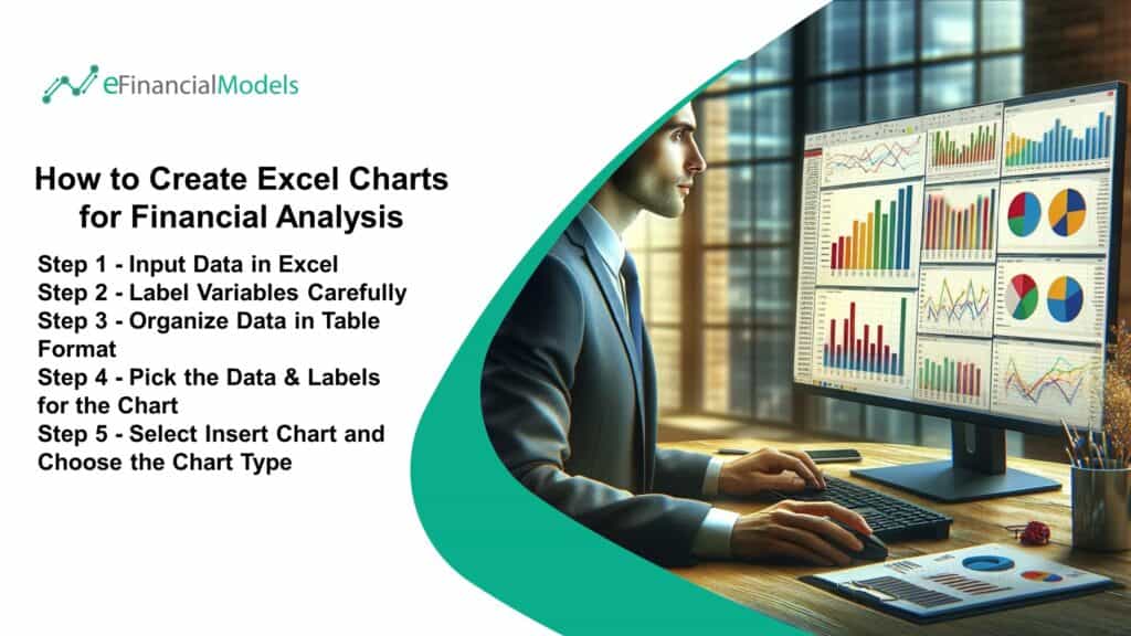
Maximize Success Using Financial Chart Templates
Creating engaging and informative financial chart templates in Excel allows you to bring your data to life, making it easier for you and your audience to understand and analyze complex information. This process not only simplifies the presentation of data but also enhances the decision-making process by highlighting key trends, comparisons, and patterns that may take time to be evident through raw data alone. Whether presenting to stakeholders, managing projects, or just trying to make sense of your finances, financial chart templates in Excel help visualize data effectively and efficiently. Moreover, leveraging Excel's financial chart templates can significantly boost productivity and ensure presentation consistency. These templates are tailor-made to meet various financial reporting needs, from budgeting and forecasting to financial analysis and performance tracking. By utilizing financial chart templates, you can focus more on interpreting the data rather than getting bogged down with the intricacies of chart design. This approach saves time and maximizes the impact of your financial presentations, ensuring that your message is delivered clearly and compellingly. In summary, mastering the art of creating charts in Excel and utilizing financial chart templates are invaluable skills that can enhance your data visualization capabilities. These tools empower you to present data in a more accessible and impactful manner, paving the way for informed decision-making and successful communication of complex information. Start exploring these features to transform your data into compelling visual stories that captivate and inform.
You might also like: