
0 ITEMS

How to Create a Financial Waterfall Chart?
Financial waterfall charts graphically show how revenue, expenses, and other financial components impact a company’s bottom line.
- They help visualize step-by-step changes in cash flow, profit, and costs, making complex data easier to interpret.
- Excel remains a top tool for building these charts, offering templates and customization options for financial analysis.
- Different types of waterfall charts serve specific purposes, such as tracking time-based changes or explaining variances.
In this guide, you’ll find practical steps for creating, formatting, and sharing accurate waterfall charts to improve financial decision-making.
What Is a Waterfall Chart Diagram in MS Excel?
A waterfall chart is a visual tool that shows how an initial value changes through a series of positive and negative adjustments. It helps break down complex financial data into clear, step-by-step movements, like revenue changes or cost variations. Each bar represents a change, making it easy to see the impact of each factor. The chart starts with a baseline value, adds or subtracts items, and ends with the final result.
Excel is the best tool for building waterfall charts because it offers built-in templates and easy customization. Users can create these charts using stacked column charts with invisible segments to show step-by-step changes. Other tools like Google Sheets, Tableau, and Power BI also support waterfall charts, but Excel remains the top choice for its flexibility and widespread use.
An Excel waterfall chart visually tracks how values change over time or categories. Floating columns show positive and negative changes, while a split Y-axis separates gains and losses. If values cross the X-axis, the chart adjusts automatically, like when cash flow moves from positive to negative. Connector lines help link the changes, though some charts may not include them. Gaps between columns create a “floating” effect, making the shifts easier to see. These features make Waterfall charts useful for financial analysis, helping users understand how different factors impact totals.
There are several financial waterfall charts, each serving different analytical purposes. The most commonly used are:
- A Standard Waterfall Chart tracks sequential increases and decreases.
- A Stacked Waterfall Chart breaks down contributions within each category.
- A Time-Based Waterfall Chart monitors changes over time.
- A Bridge Waterfall Chart explains variances between two values.

Traditionally, financial waterfall charts use a vertical layout. At eFinancialModels, we feature a Horizontal Waterfall Chart by Andrei Okhlopkov. The template lays financial data horizontally, making it easier to follow. Colored arrows show increases and decreases to understand trends quickly. You can fully customize the chart to fit your needs, and it updates automatically when you change the data.

5 Key Importance of Financial Waterfall Charts
A financial waterfall chart shows how money moves step by step, making it easy to see what adds to or takes away from profits. It’s like watching a bucket fill and empty, helping businesses understand where their cash goes. Instead of looking at confusing spreadsheets, companies can quickly spot trends, problems, or hidden costs. This chart is a powerful tool for making smart decisions, setting goals, and planning for the future. Whether tracking revenue, expenses, or investments, a financial waterfall chart turns complex numbers into a clear, visual story.
- Clear Visualization: Financial waterfall charts effectively illustrate how an initial financial value, such as revenue or net income, is influenced by various factors, including costs, expenses, and other adjustments, helping businesses see the step-by-step impact on financial performance. For example, a revenue waterfall chart shows a company’s total revenue is derived from different sources. It breaks down revenue by product lines, geographical regions, or business segments.
- Enhance Financial Presentations: Financial waterfall charts simplify complex financial data into an easy-to-understand format, making them valuable tools for investor presentations, board meetings, and management reports where clear communication of financial performance is crucial. One great example is a Profit & Loss (P&L) Waterfall Chart, which shows the transition from revenue to net profit. It breaks down key elements such as gross profit, operating profit, taxes, and interest expenses. These elements are useful for understanding the impact of various financial components on earnings.
- Facilitate Smart Decisions: With a structured representation of financial data, executives and stakeholders can make more informed decisions about budgeting, cost-cutting, and investment opportunities based on how different elements affect the bottom line. For instance, a Cash Flow Waterfall Chart maps cash inflows and outflows over a specific period. It includes sources like operating cash flow, investing activities, and financing activities. This helps assess liquidity, working capital management, and financial sustainability.
- Helps Identify Key Drivers: By breaking down financial components, financial waterfall charts allow businesses to pinpoint the main contributors to profit growth or decline, making it easier to assess the effectiveness of revenue streams and cost management strategies. For instance, an Expense Waterfall Chart illustrates how operating expenses accumulate and impact profitability. It segments expenses into Cost of Goods Sold (COGS), Selling, General & Administrative Expenses (SG&A), and Research & Development (R&D). It helps identify cost-reduction opportunities and spending inefficiencies.
- Support Variance Analysis: Financial waterfall charts help analyze financial variances by showing actual versus expected performance, making them useful for forecasting future trends and assessing the impact of strategic decisions on financial outcomes. An Investment Returns Waterfall Chart visualizes how investment returns are distributed among stakeholders. It demonstrates how profits flow through different investor tiers.




















































How to Create a Waterfall Chart in Excel: 4 Simple Steps
How to create a waterfall chart in Excel means showing how numbers change step by step. Instead of just seeing the total, you can show where increases and decreases happen. Excel makes it easy to create one. Follow these 4 steps on how to create a waterfall chart in Excel:
Step 1 – Organize Your Input Data
First, you need to set up your data correctly. You need two columns: one for labels and one for values. The label column contains the categories or items that represent the individual components of the calculation. At the same time, the values contain the numerical values corresponding to each label. You can’t just use one column because Excel needs to know what each number represents. Some numbers will be positive, and some will be negative. This setup helps Excel understand how to build the chart.
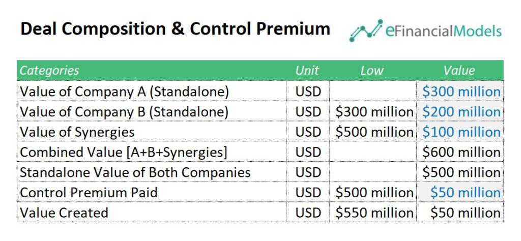
The first step on how to create a waterfall chart in Excel is identifying key labels and values. The chart above is about Deal Composition & Control Premium transactions. The dataset includes categories and units in the label column. Each label represents a deal component, showing how different factors contribute to the total value. The standalone value of both companies acts as the starting point in the values column, and increments like synergies and control premiums build toward the final outcome.
Step 2 – Insert a Two-Column Chart
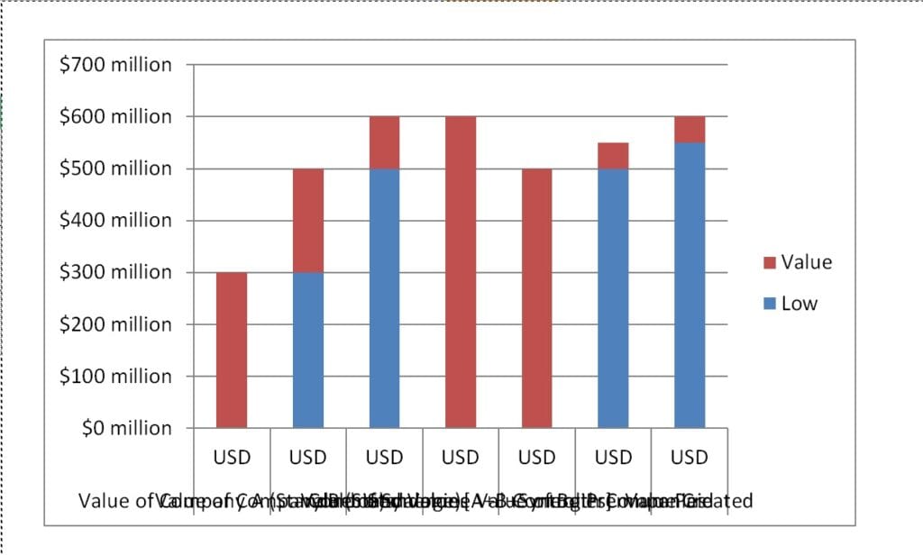
Once your data is ready, select it. To create a waterfall chart in Excel using a normal chart, select your data with two columns—one for categories and another for values. Click on the Insert tab, choose Column Chart, and select Stacked Column. Excel will automatically create a chart that shows how each value adds or subtracts from the total. If the chart looks wrong, check that your data is correctly entered.

Here is the resulting Waterfall Chart example:
Step 3 – Format & Customize the Chart
The 3rd step in how to create a waterfall chart in Excel is to make your chart clear and easy to read. To format a waterfall chart in Excel, select the chart and use the Chart Tools options—Design, Layout, and Format. Adjust the first column to represent starting values, the second for increases, and the third for decreases. Format the bars by setting the base series to no fill to create the floating effect. Change colors and styles, or switch the chart type in the Design tab. Use the Layout tab to add titles, labels, or a legend for better clarity. Adjust bar colors, borders, and text styles in the Format tab to match your preferences. Right-click on any bar to modify its color or set totals as standalone values. Fine-tune gridlines and background for a polished look. These tools help create a clear, professional waterfall chart. Furthermore, you can customize the chart by adding a title, adjusting the legend settings, and modifying gridlines for better clarity.
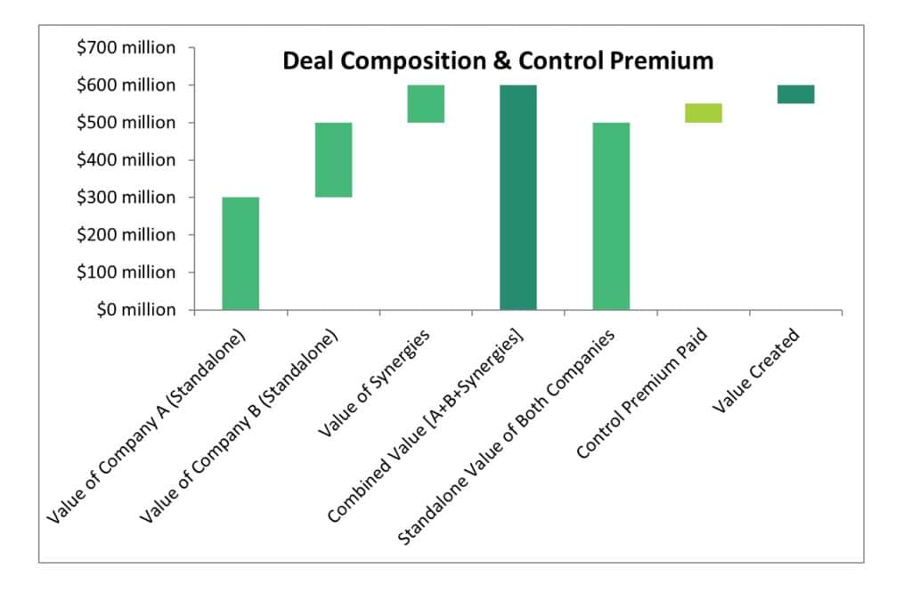
The modified waterfall chart above improves clarity and readability. The title “Deal Composition & Control Premium” has been added for context. The axis labels are clearer, ensuring the values and company breakdowns are easily read. The bars now have distinct shades to differentiate components like standalone values, synergies, and control premium. Additionally, the text labels on the x-axis are no longer overlapping, making it easier to understand the data flow. These modifications enhance the chart’s effectiveness in visually conveying deal value creation.
Step 4 – Save and Share
Once your chart looks good, save your work. Click File > Save As and choose your format. You can save it as a PDF or copy it into a presentation if you want to share it. Now you have a clear visual that explains how numbers change over time!
Enhancing Accuracy: The Power of a Waterfall Chart Example Template
The process on how to create a waterfall chart in Excel is simple and effective. Start by organizing your input data clearly. Next, insert a two-column stacked chart from the chart options. Then, customize the formatting to highlight key financial movements. Finally, save and share your chart for analysis and decision-making. A well-structured waterfall chart helps visualize financial changes at a glance, making it a powerful tool for business insights.

Using a waterfall chart example template boosts accuracy and efficiency. It simplifies data entry, ensures consistency, and highlights key financial changes. With a structured format, you avoid errors and focus on insights. Customizing colors and labels makes trends easy to spot. A well-designed template saves time and improves financial analysis for better decision-making.
You can check our Private Equity Waterfall Distribution Models. These templates simplify complex payout structures, ensuring accurate allocations for investors and partners. Automate calculations, reduce errors and save time with a structured, easy-to-use model. Customize key inputs and visualize cash flows instantly.
Get a professional, investor-ready tool to streamline your financial waterfall charts today!
You might also like:
- 10 Ideas to Increase Average Revenue Per User
- 10 Main Elements of a Business Plan
- Best in Class Property Appraisal Methods and What to Look Out for
- Cash Flow Analysis in Excel
- How to Create a Price Comparison Template?
- How to Build a Capitalization Table
- How to Make a Startup Financial Plan for Fundraising?
- Real Estate Financial Modeling in Excel
- Pricing Analysis
- Financial Model Templates Easy to Use
- Financial Modeling for Startups and Small Businesses
- Private Equity vs. Venture Capital: Which is Right for You
- 10 Tips to Develop a First Class Business Valuation Report
- Financial Forecasting Models by eFinancialModels
- Understanding Insurance Policies: A Beginner’s Guide
- Business Valuation Service
- Developing a 5 Year Financial Projection Template
- Using Financial Statements to Guide Business Decisions
- Online Businesses Financial Model Bundle
- Financial Modeling using Excel
Tags: Chart