“Budget-versus-Actual” Charts
A collection of elegant charts and dashboards depicting variances
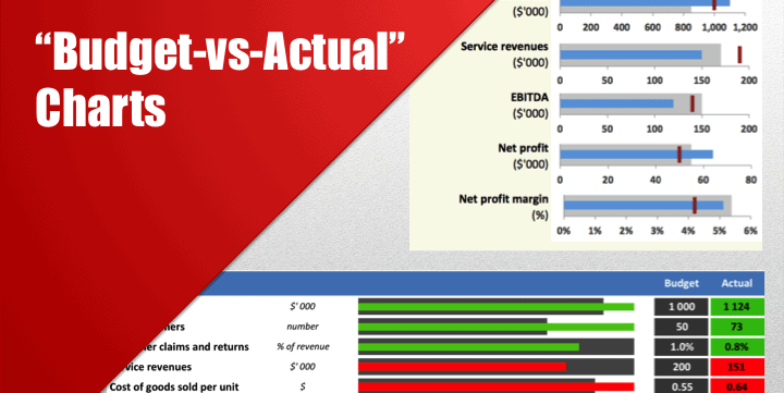
This file contains magazine-quality charts in Excel to illustrate variances between budgeted and actual figures.
Professionally designed charts in business documents and presentations immediately grab readers’ attention. They make readers go through your materials more thoroughly. And they are certainly a great tool to present data and draw conclusions.
The charts included in this publication are:
1. Monthly sales: budget vs. actual (total and variances)
2. Key financial metrics mini-dashboard (budget-actual-prior year)
3. Sales growth rates by product (budget-actual-prior year)
4. KPI dashboard (different kinds of indicators with the different magnitude on the same chart)
5. Charts showing budget-to-actual changes in volumes, prices, and mixes by product
6. Charts showing budget-to-actual changes in volumes, prices, and mixes by product
7. A column chart showing three dimensions of data
The charts are quite flexible to updates and modifications. You can replace products with e.g. departments or geographic regions. Instead of budgets and actuals, you can apply them to reporting periods or model scenarios. Revenues, profits, etc. can be changed to any other indicators.
All charts have comments concerning the type of charts used, series, axes, key formatting information. The most complex charts are accompanied by detailed instructions on how to create them from scratch.
Similar Products
Other customers were also interested in...
Complete Three-Statement Monthly Budget with Scena...
This is a comprehensive set of templates that will help you build your budget. The templates are bui... Read more
Complete Three-Statement Monthly Budget
This is a comprehensive set of templates that will help you build your budget. The templates are bui... Read more
Complete Three-Statement Quarterly Budget with Sce...
This is a comprehensive set of templates that will help you build your budget. The templates are bui... Read more
Complete Three-Statement Quarterly Budget
This is a comprehensive set of templates that will help you build your budget. The templates are bui... Read more
Complete Private Equity (LBO) Financial Model
This is a professional financial model which performs a thorough assessment of a private equity proj... Read more
Private Equity Fund Model (Investor Cashflows)
Private Equity Financial Model to analyze fund cashflows and returns available to Limited Partners (... Read more
All My Financial Models, Spreadsheets, Templates, ...
Lifetime access to all future templates as well! Here is a set of spreadsheets that have some of the... Read more
Due Diligence P&L – Exhaustive Revenue a...
Model for in depth understanding of high level profit and loss and revenue analysis. Big-4 like chec... Read more
Startup Company Financial Model – 5 Year Fin...
Highly-sophisticated and user-friendly financial model for Startup Companies providing a 5-Year adva... Read more
Advanced Financial Model with DCF & Valuation
General Overview Advanced Financial Model suitable for any type of business/industry and fully cu... Read more
You must log in to submit a review.


