
0 ITEMS

A Chart Showing Three Dimensions of Data
A professionally-designed chart which can show data in three measurements

| All Industries |
| Chart, Dashboard |

This is a nice and smart chart that you can adapt to many situations when you need to display three dimensions of data. This will help you make your presentations look professional and your reports – impress your clients, managers, and colleagues.
In this example, the chart shows:
1. Change from 2015 to 2018
2. In Revenues and EBITDA
3. For three products
Despite the apparent complexity, the chart is very intuitive and is very quickly understood by the users. These measurements can be replaced with any others, for example:
– split by regions (countries), by departments within your company
– change from budget to actual,
– variance in different P&L (incomes, costs) or balance sheet amounts (inventory, fixed assets, accounts payable), or in physical measurements (number of units sold, number of customers or employees).
The heading and the commentary block on the chart can obviously be changed as well. You can also adjust the format of the chart (colors, fonts, etc.) as you like.
All components of the chart (arrows, columns, shaded areas) are native chart elements and are updated automatically as you change the source data, without any manual intervention.
The attached file contains the chart itself and very detailed step-by-step explanations of how such a chart can be set up from scratch. These instructions might serve as an Excel refresher and as a guide to developing other professionally designed charts.
File type: .xlsx
Similar ProductsOther customers were also interested in...


 Andrei Okhlopkov
Due Diligence Tools and Methods
A suite of best practices to perform financial and commercial due diligence. Use it if you are consi... Read more
Complete Three-Statement Monthly Budget with Scena...
This is a comprehensive set of templates that will help you build your budget. The templates are bui... Read more
Complete Three-Statement Monthly Budget
This is a comprehensive set of templates that will help you build your budget. The templates are bui... Read more
Complete Three-Statement Quarterly Budget with Sce...
This is a comprehensive set of templates that will help you build your budget. The templates are bui... Read more
Complete Three-Statement Quarterly Budget
This is a comprehensive set of templates that will help you build your budget. The templates are bui... Read more
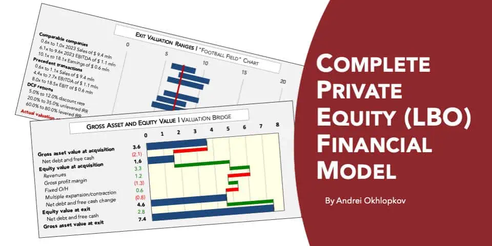
Complete Private Equity (LBO) Financial Model
This is a professional financial model which performs a thorough assessment of a private equity proj... Read more

 Anuj
Anuj
Private Equity Fund Model (Investor Cashflows)
The Private Equity Fund Cashflows Model helps LPs and GPs analyze fund cash flows, returns, and dist... Read more
 Jason Varner
All My Financial Models, Spreadsheets, Templates, ...
Lifetime access to all future templates as well! Here is a set of spreadsheets that have some of the... Read more

 Giorgos
Advanced Financial Model with DCF and Valuation
Dynamic 10-Year Financial Model, suitable for any type of business, supporting strategic planning, i... Read more
 Pierre-AlexandreHeur...
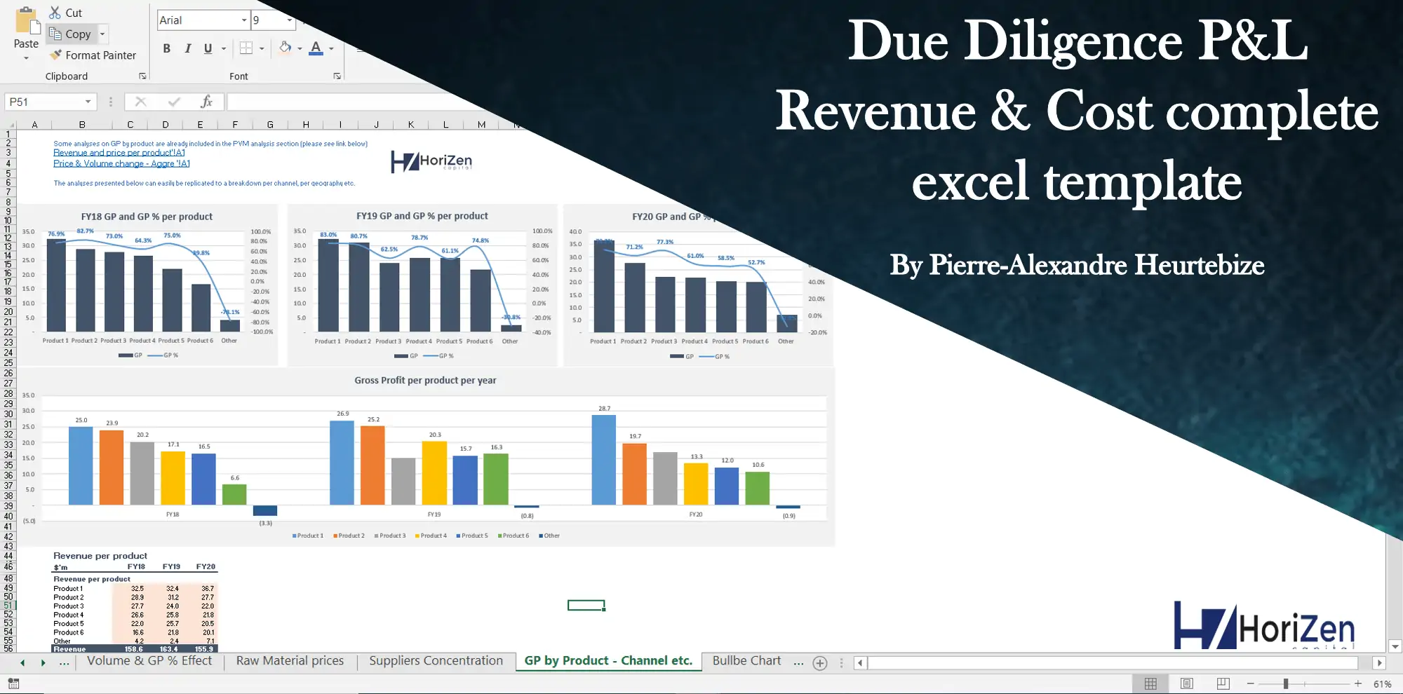
Due Diligence P&L – Exhaustive Revenue a...
Model for in depth understanding of high level profit and loss and revenue analysis. Big-4 like chec... Read more
You must log in to submit a review.