0 ITEMS

Gantt Chart in Excel: 2 Methods With Real Formulas
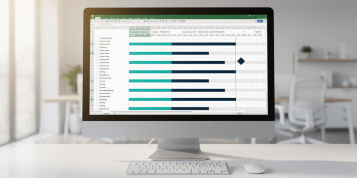
You can build a fully functional Gantt chart in Excel in under 30 minutes using either the stacked bar chart method or the conditional formatting method, and this guide shows you exactly how to do both.
Key Takeaways
- A Gantt chart in Excel requires 5 core columns: Task Name, Start Date, Duration (days), End Date (formula-calculated), and Completion %.
- The stacked bar chart method works in Excel 2013 and later, including Microsoft 365 and Excel for Mac 2016+.
- The conditional formatting method scales better for projects with 30+ tasks because it avoids chart object overhead.
- Setting the minimum axis value to the project start date’s serial number (a number Excel uses internally to represent dates) is the single most common formatting fix beginners miss.
- A 15-task Gantt chart built from scratch takes roughly 45-60 minutes; a pre-built template cuts that to under 10 minutes.
- Excel Gantt charts become impractical beyond approximately 50 tasks or 5 concurrent team members due to version control and dependency-tracking limits.
- Both methods work without macros or add-ins, making them safe for locked-down corporate environments.
What Is a Gantt Chart and When Excel Is the Right Tool
A Gantt chart is a horizontal bar chart that maps each project task against a calendar timeline, showing start dates, durations, and overlaps at a glance. Henry Gantt popularized the format in the early 1900s, and it remains the dominant visual format for project scheduling today.
Excel is the right tool when your project has fewer than 50 tasks, your team has 5 or fewer collaborators, and you don’t need automatic dependency tracking or resource leveling. According to the Project Management Institute, Excel and spreadsheet tools remain among the most widely used project tracking tools for small and mid-size teams. Source
Microsoft 365 Excel is installed on over 1.2 billion devices worldwide. Source This means your Gantt chart is readable by virtually every stakeholder without a software license.
Finance teams in particular favor Excel Gantt charts for audit timelines, budget rollout schedules, and financial modeling project plans because the data lives in the same environment as the underlying numbers.

Excel Gantt charts are optimal for projects under 50 tasks with small teams. Beyond that threshold, dedicated PM tools provide dependency tracking and collaboration features Excel cannot match.
Setting Up Your Data Structure: Required Columns and Formulas
The data structure is the foundation of any Excel Gantt chart, and getting it right prevents every downstream formatting problem.
Set up your worksheet with these 5 columns in this exact order:
| Column | Header | Example Value | Notes |
|---|---|---|---|
| A | Task Name | Budget Review | Plain text |
| B | Start Date | 01/06/2025 | Date format |
| C | Duration | 5 | Integer (days) |
| D | End Date | =B2+C2 | Formula |
| E | Completion % | 60% | Percent format |
The End Date formula =B2+C2 adds the duration (an integer) to the start date (an Excel serial number, meaning the integer Excel uses internally to store dates, where January 1, 1900 = 1). This produces the correct end date without any date function complexity.
Format column B and column D as dates: select both columns, press Ctrl+1, choose Date, and pick your preferred display format. Keep column C as a plain number. This separation of start date and duration is critical because the stacked bar chart method reads duration as bar length, not the end date directly.
Add a helper row above your data (row 1 as headers, data starting row 2) so Excel’s chart wizard picks up the correct range. For a 15-task project, your data runs from B2:E16.
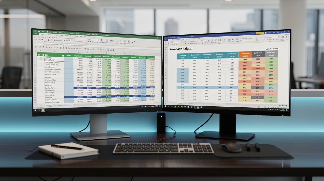
The End Date formula =B2+C2 adds duration days to the start date serial number, automatically recalculating when either input changes.
Method 1: Creating a Gantt Chart Using Stacked Bar Charts
The stacked bar chart method converts a standard Excel bar chart into a Gantt chart by making the first data series invisible, leaving only the duration bars visible against the timeline axis. This method works in Excel 2013, 2016, 2019, 2021, and Microsoft 365 on both Windows and Mac.
Step 1: Select your data range.
Highlight A1:C16 (Task Name, Start Date, Duration only). Do not include the End Date or Completion % columns at this stage.
Step 2: Insert the chart.
Go to Insert > Charts > Bar Chart > Stacked Bar (the second option in the 2-D Bar row). Excel generates a chart with two colored series stacked horizontally.
Step 3: Make the Start Date series invisible.
Click any bar in the first data series (the Start Date bars, which appear on the left side of each task bar). Right-click and choose Format Data Series. Under Fill, select No Fill. Under Border, select No Line. The start date bars disappear, leaving only the duration bars, which now look like floating Gantt bars.
Step 4: Fix the date axis.
Click the horizontal (bottom) axis. Press Ctrl+1 to open Format Axis. Under Axis Options, set the Minimum value to the serial number of your project start date. To find that number: click an empty cell, type your start date, then format the cell as a Number (not a Date). The integer that appears is your serial number. For June 1, 2025, the serial number is 45809. Enter 45809 as the axis minimum. This aligns the bars with the correct calendar dates.
Step 5: Reverse the task order.
Click the vertical (left) axis. In Format Axis, check the box labeled “Categories in reverse order.” This puts Task 1 at the top, matching standard Gantt chart reading direction.
Step 6: Remove the legend and gridlines.
Click the legend and press Delete. Click any gridline and press Delete. These elements add visual noise without adding information.
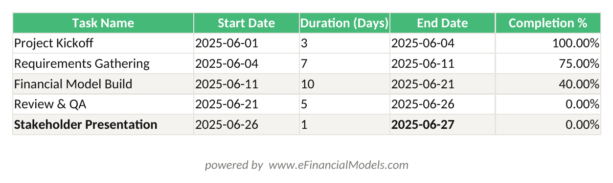
End Date = Start Date + Duration (days). Completion % drives the second conditional formatting rule to shade finished portions of each task bar.
Method 2: Creating a Gantt Chart Using Conditional Formatting
The conditional formatting method (where Excel applies cell background colors based on a formula rule) builds the Gantt chart directly in the spreadsheet grid rather than as a separate chart object. This approach scales better for large projects and is easier to update because you’re editing cells, not chart objects.
Step 1: Set up a date header row.
In row 1, starting from column F, enter consecutive dates spanning your project. In F1, type your project start date. In G1, type =F1+1. Copy G1 across as many columns as your project has days. Format row 1 as dates showing only the day number (format code: d) to save horizontal space.
Step 2: Write the conditional formatting formula.
Select the range F2 to the last date column and last task row (for example, F2:BJ16 for a 60-day, 15-task project). Go to Home > Conditional Formatting > New Rule > Use a formula to determine which cells to format.
Enter this formula:=AND(F$1>=$B2, F$1<$B2+$C2)
This formula checks two conditions simultaneously (AND is a logical function that returns TRUE only when all conditions are true): the date in the header row (F$1) is on or after the task start date ($B2), AND the date is before the task end date ($B2+$C2). The dollar signs lock the row reference for the date header and the column reference for start date and duration, so the formula adjusts correctly as it copies across the entire selected range.
Step 3: Set the fill color.
In the Format dialog, choose Fill and select your preferred bar color (a medium blue or teal works well for professional reports). Click OK.
Step 4: Add a second rule for completion tracking.
Repeat the process with this formula to show a darker shade for completed portions:=AND(F$1>=$B2, F$1<$B2+($C2*$E2))
This multiplies duration by completion percentage ($E2) to calculate how many days are done. Place this rule above the first rule in the Conditional Formatting Rules Manager so it takes priority.
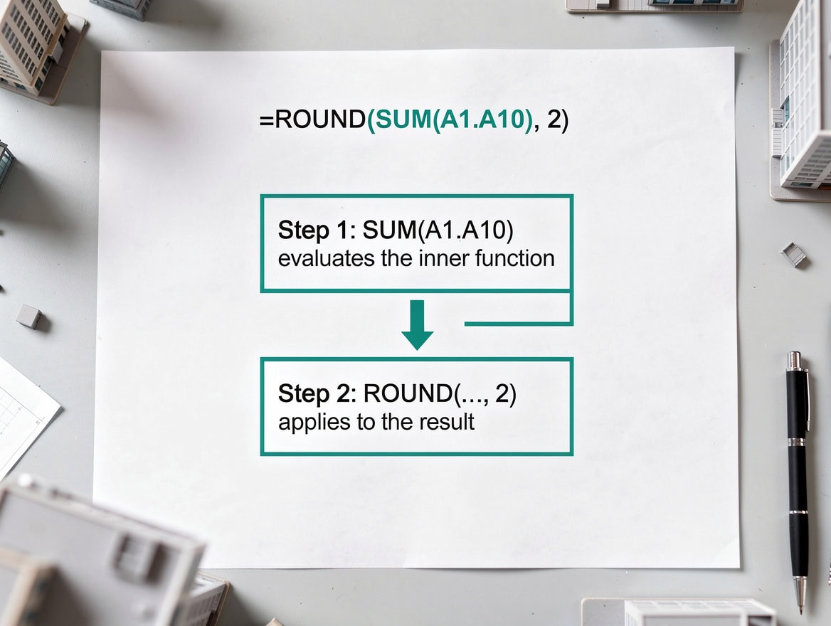
*The AND formula checks two conditions: the header date falls on or after the task start, and before the calculated end date. Dollar signs lock the correct row and column references as the rule copies across the range.*
Formatting Your Excel Gantt Chart for Professional Presentation
Professional formatting removes visual clutter and ensures the chart reads clearly in printed reports and slide decks.
Apply these 6 formatting rules consistently:
- Color palette: Use one primary bar color (corporate blue or teal) and one accent color for milestones. Avoid red and green together (colorblind accessibility).
- Font: Use the same font as your company’s report template, typically Calibri 10pt or Arial 9pt for axis labels.
- Gridlines: Keep only major vertical gridlines aligned to week boundaries. Delete all horizontal gridlines.
- Bar height: In the stacked bar method, right-click any bar, choose Format Data Series, and set Gap Width to 50% for readable bar thickness.
- Milestone markers: Add a separate data series with a single-day duration and format it as a diamond marker (Format Data Series > Marker > Diamond, size 8pt).
- Print setup: Set the print area to include the chart and the task list. Use Page Layout > Fit to 1 page wide to prevent axis truncation in printed reports.
For the conditional formatting method, freeze the first 5 columns (Task Name through Completion %) using View > Freeze Panes > Freeze First Column (applied 5 times, or use View > Freeze Panes > Freeze Panes after selecting column F). This keeps task names visible while scrolling through the date columns.
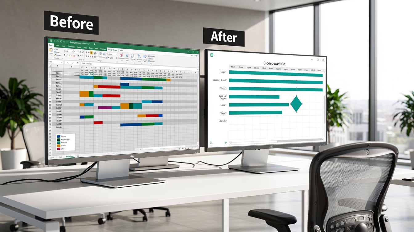
*Removing the legend, reducing gridlines to weekly intervals, and standardizing bar colors transforms a default Excel chart into a presentation-ready project timeline.*
Adding Task Dependencies and Milestones
Excel does not automatically draw dependency arrows between tasks, but you can represent dependencies visually and structurally.
For visual dependencies, use Insert > Shapes > Line with Arrow. Draw the arrow from the end of the predecessor task bar to the start of the successor task bar. Hold Shift while drawing to keep the line horizontal or vertical. Group the arrow with the chart (select both, right-click, Group) so it moves with the chart when you resize it.
For structural dependencies, add a column F labeled “Predecessor” and enter the row number of the task that must finish first. Then modify the Start Date formula for dependent tasks:=D[predecessor row]
For example, if Task 3 (row 4) depends on Task 2 (row 3) finishing, set B4 to =D3. Now when Task 2’s duration changes, Task 3’s start date updates automatically.
For milestones, add a row with Duration = 1 and format the bar with a diamond marker as described in the formatting section. Label the milestone directly on the chart using Insert > Text Box.
Updating and Maintaining Your Excel Gantt Chart
A Gantt chart only has value if it stays current. Build your update workflow into the file structure from the start.
For the stacked bar method, update the Duration column (C) and Completion % column (E) weekly. The chart updates automatically because it reads from the data range. Do not manually resize bars.
For the conditional formatting method, update Start Date (B), Duration (C), and Completion % (E). The colored cells recalculate instantly.
To add a new task without breaking formatting:
- In the stacked bar method: insert a row within the existing data range (right-click a row number inside the range and choose Insert). Do not add rows below the last data row, as the chart may not pick them up automatically. After inserting, right-click the chart, choose Select Data, and verify the data range includes the new row.
- In the conditional formatting method: insert a row within the formatted range. The conditional formatting rule automatically extends to the new row because it applies to the entire range.
Save a master template version with no data (only headers and formulas) as a separate file named gantt-template-master.xlsx. Copy this file at the start of each new project rather than modifying the live file.
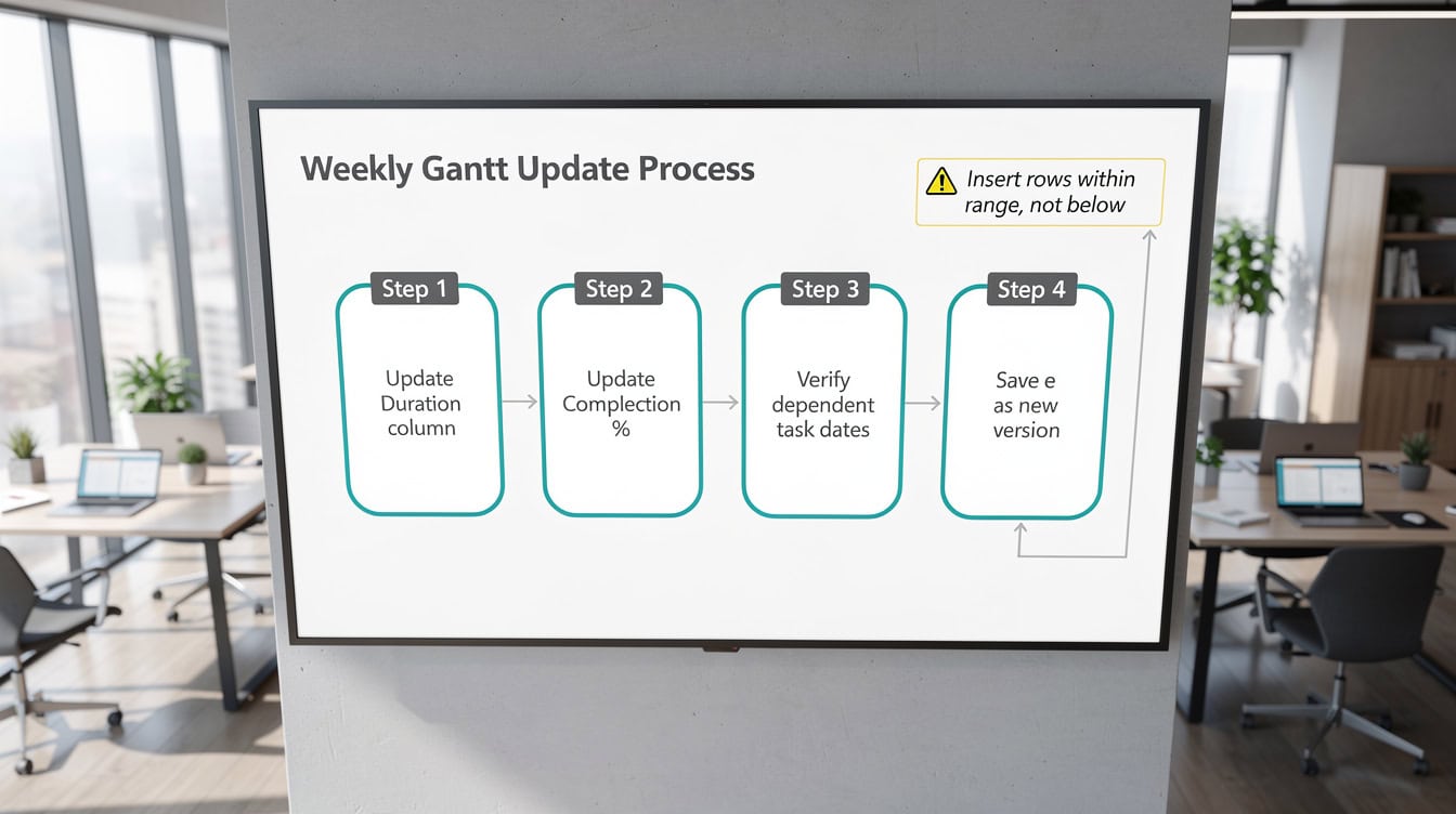
*Inserting new task rows within the existing data range, rather than below it, ensures the chart data range and conditional formatting rules automatically include the new row.*
Excel Gantt Chart Limitations and When to Use Dedicated Software
Excel Gantt charts are a practical tool for small projects, but they have real constraints that matter at scale.
| Factor | Excel Gantt | MS Project | Asana / Monday |
|---|---|---|---|
| Max practical tasks | ~50 | 1,000+ | Unlimited |
| Auto dependencies | No | Yes | Yes |
| Resource leveling | No | Yes | Partial |
| Real-time collaboration | Limited | Limited | Yes |
| Cost | Included in Office | $10+/user/mo | $10-25/user/mo |
| Learning curve | Low | High | Low-Medium |
| Offline access | Yes | Yes | Limited |
Excel becomes the wrong tool when your project exceeds 50 tasks, when you have more than 5 people editing the file concurrently, or when automatic dependency recalculation is required. According to the Project Management Institute’s Pulse of the Profession report, organizations that use purpose-built project management tools report 28% more projects delivered on time than those relying on spreadsheets alone. Source
For finance teams managing audit timelines, budget rollout schedules, or financial model build plans, Excel Gantt charts remain the preferred choice because the project data and the financial model live in the same workbook. The EFM General Excel Financial Models library includes project tracking templates built specifically for this use case.

*Excel’s zero marginal cost and universal availability make it the default choice for small projects, but the absence of automatic dependency tracking becomes a real constraint beyond 50 tasks.*
Common Mistakes and How to Fix Them
These 5 mistakes account for the majority of broken or misleading Excel Gantt charts.
Mistake 1: Bars start at the wrong position.
Cause: The horizontal axis minimum is set to Auto instead of the project start date serial number. Fix: Set the axis minimum manually as described in Method 1, Step 4.
Mistake 2: Tasks appear in reverse order (Task 1 at the bottom).
Cause: Excel plots the first row at the bottom of a bar chart by default. Fix: Check “Categories in reverse order” in the vertical axis Format Axis pane.
Mistake 3: Conditional formatting formula doesn’t extend to new rows.
Cause: The rule was applied to a fixed range (e.g., F2:BJ16) and new rows were added below row 16. Fix: Update the rule range in Conditional Formatting Rules Manager to include the new rows, or insert rows within the existing range rather than below it.
Mistake 4: Date axis shows numbers instead of dates.
Cause: The axis is formatted as General or Number. Fix: Select the axis, press Ctrl+1, and set the Number format to Date with your preferred display format.
Mistake 5: The chart breaks when the workbook is shared via email.
Cause: Linked data ranges or external references break when the file path changes. Fix: Keep all data on the same sheet as the chart, and use no external workbook references in the Gantt data range.

*The axis minimum error (bars starting at the wrong date) is the single most reported setup problem in Excel Gantt charts and requires entering the project start date’s serial number manually.*
Excel Gantt Chart Templates
Building a Gantt chart from scratch for a 15-task project takes 45-60 minutes. A pre-built template reduces that to under 10 minutes because the data structure, formulas, conditional formatting rules, and chart formatting are already in place.
The EFM Excel Gantt chart template collection includes templates for financial project tracking, audit timelines, and budget rollout schedules. Each template uses the conditional formatting method for scalability and includes pre-built completion tracking, milestone markers, and a print-ready layout.
For broader Excel financial modeling resources, the EFM Excel template library covers budgeting, forecasting, and project finance models that pair naturally with a Gantt chart for full project oversight.
If you need a standalone budget planning tool alongside your Gantt chart, the Simple Budget Planner Template provides a compatible structure for tracking project costs in parallel with your timeline.
Frequently Asked Questions
Does the stacked bar chart Gantt method work in Excel for Mac?
Yes. The stacked bar chart method works in Excel for Mac 2016 and later, including all Microsoft 365 Mac versions. The menu navigation is identical: Insert > Bar Chart > Stacked Bar. The Format Axis pane on Mac uses the same options as Windows, including the Minimum value field where you enter the project start date serial number. One difference: on Mac, you access Format Data Series by double-clicking a bar rather than right-clicking. The conditional formatting method also works fully on Mac with no differences in formula syntax or rule setup.
How do I show weekends as shaded columns in my Excel Gantt chart?
Add a third conditional formatting rule to the date header range using this formula: =WEEKDAY(F$1,2)>5. The WEEKDAY function (which returns a number from 1 to 7 representing the day of the week) with the second argument set to 2 returns 6 for Saturday and 7 for Sunday. The condition >5 catches both. Apply a light gray fill to this rule and place it below your task bar rules in the Rules Manager so the task bars still show on weekend columns when tasks run through them. This gives stakeholders an immediate visual cue about non-working days without removing those columns from the timeline.
What is the maximum number of tasks an Excel Gantt chart can handle reliably?
In practice, the stacked bar chart method becomes slow and difficult to read beyond 30-40 tasks because the chart object grows large and bar labels overlap. The conditional formatting method handles up to 80-100 tasks before workbook recalculation slows noticeably, depending on your machine’s RAM and the number of conditional formatting rules active. The Project Management Institute notes that spreadsheet-based project tracking is most effective for projects with fewer than 50 tasks and fewer than 10 team members. Beyond those thresholds, dedicated tools like MS Project or Asana provide automatic dependency management and resource leveling that Excel cannot replicate.
Can I calculate task end dates automatically when I change a duration?
Yes, and this is one of Excel’s strongest features for Gantt charts. Use the formula =B2+C2 in the End Date column (column D), where B2 is the Start Date and C2 is the Duration in days. When you change the value in C2, D2 updates instantly. For dependent tasks, chain the formulas: if Task 3 starts when Task 2 ends, set Task 3’s Start Date to =D2 (Task 2’s End Date). Now changing Task 2’s duration automatically shifts Task 3’s start date and all subsequent dependent tasks. This formula chain is the closest Excel gets to automatic dependency tracking, though it requires you to set up the relationships manually.
How do I share an Excel Gantt chart with stakeholders who don’t have Excel?
Three options work reliably. First, export to PDF: go to File > Export > Create PDF/XPS and set the print area to include both the task data and the chart. Second, copy the chart as an image: right-click the chart, choose Copy, then in PowerPoint or Word use Paste Special > Picture (PNG). Third, upload the workbook to Microsoft OneDrive or SharePoint, which renders Excel files in a browser without requiring an Excel license. For the conditional formatting method, the browser view preserves the colored cells accurately. For the stacked bar chart method, verify the browser rendering before sharing, as complex chart formatting occasionally displays differently in Excel Online compared to the desktop application.
Why does my Gantt chart bar start at the wrong date on the axis?
This is the most common setup error, and it has one specific cause: the horizontal axis minimum is set to Auto, so Excel picks a default start value that doesn’t match your project start date. The fix is to set the axis minimum to the Excel serial number of your project start date. To find the serial number: type your start date in any empty cell, then format that cell as a Number (not a Date) using Ctrl+1. The integer displayed, for example 45809 for June 1, 2025, is the serial number. Enter that exact integer as the axis Minimum in Format Axis > Axis Options. The bars will immediately snap to the correct calendar position.
Is it worth building an Excel Gantt chart if my team already uses Asana or Monday.com?
Generally, no, unless your project data needs to integrate directly with an Excel financial model. If your team already uses a dedicated project management tool, duplicating the timeline in Excel creates version control risk: two sources of truth for the same project schedule. The exception is finance teams who need the Gantt chart embedded in a financial model workbook, for example to show an audit timeline alongside the audit budget, or a product launch schedule alongside the revenue forecast. In those cases, the Excel Gantt chart adds value because it lives in the same file as the financial data it describes, eliminating the need to cross-reference two separate tools.
Conclusion
Building a Gantt chart in Excel is a repeatable, technical process, not a creative exercise. The stacked bar chart method suits teams who need a standalone visual for presentations. The conditional formatting method suits teams who need a scalable, formula-driven tracker embedded in a working spreadsheet. Both methods require the same 5-column data structure, and both work across all modern Excel versions including Microsoft 365 and Excel for Mac 2016+.
I recommend starting with the EFM Gantt chart template rather than building from scratch. The pre-built formulas, conditional formatting rules, and print-ready layout save 45 minutes of setup time and eliminate the 5 common mistakes outlined above, so you can focus on the project data rather than the chart mechanics.